
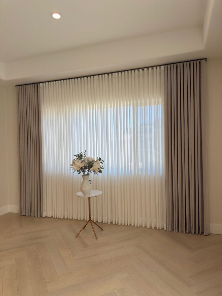
These curtain color ideas run from a quick tension-rod sheer to beaded velvet that needs a proper workroom, so the first thing to settle is whether your room needs to feel held or open.
Morning light decides it for me: east-facing bedrooms want something that eases you awake, while north-facing spaces need the curtain to do the sun’s work.
The light blue linen-look sheer and the maroon velvet with gold trim both share one detail I would carry to any choice—sheer white behind the color panel, because that layer is what actually manages the light while the front one manages the mood.
1. Beige Curtains
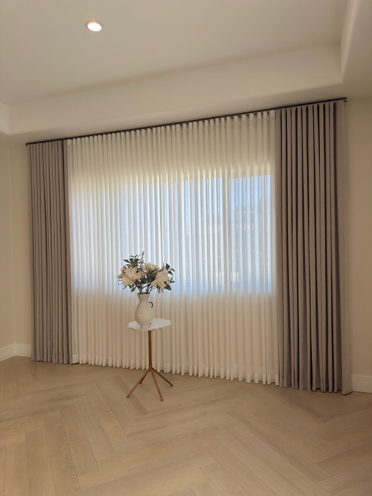
Beige side panels over white sheers give you the light control of a heavier fabric without losing the room’s brightness.
I like this pairing for rentals where you cannot change the wall color; beige reads as warmth against white or gray paint that came with the lease.
Beige picks up wood tones without matching them exactly, which is why it works across so many floor finishes.
Floor-to-ceiling height is doing the work here. Panels that skim the floor look intentional; ones that hover above it look like you mismeasured.
Hang the rod well above the frame and let the panels skim the floor; the extra height buys you length and presence even on shorter windows, and a proper hem looks intentional where hovering looks mismeasured. Same effect, same budget.
2. Blue Curtains
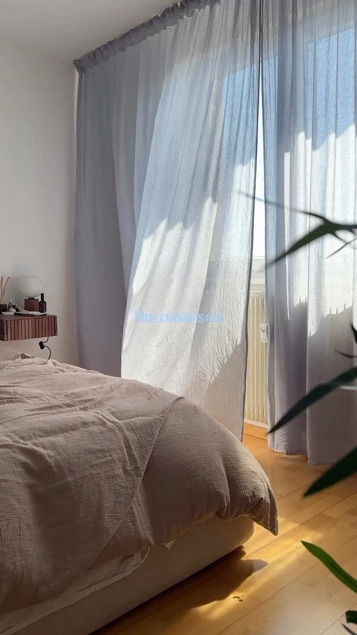
Sheer light blue turns harsh morning light into something you can wake up to gradually. I would choose this for an east-facing bedroom where blackout curtains feel too heavy but bare windows leave you squinting once the morning sun hits.
The crinkled linen on the bed shows the texture story already in the room; the curtains echo that relaxedness rather than fighting it.
For a similar look on a real budget, Target’s Threshold line carries a light blue linen-look sheer that runs cheap per panel. Polyester, not linen, but the drape reads the same from across the room.
Wash these gentle and hang damp. Heat sets wrinkles into sheers permanently.
3. Bold Blue and Grey
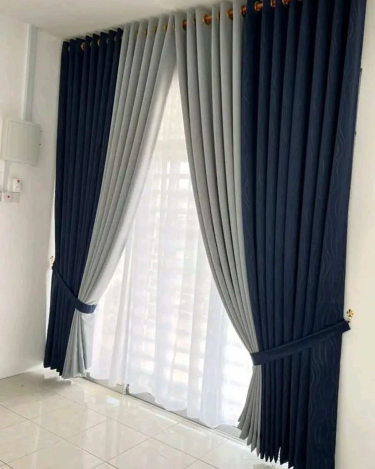
Navy and grey layered together read as one rich color from a distance and separate into something more interesting up close.
I find this works best in rooms that already have some gray in the walls or upholstery; the navy brings the depth that all-gray schemes often miss.
The double-rod setup here matters. Sheer white underneath means you can pull the color panels fully back for daylight without losing privacy.
2 rods add to the project cost, less if you use a basic black tension pair from Amazon. I would spend that money before I would spend more on the fabric itself.
4. Pink Curtains
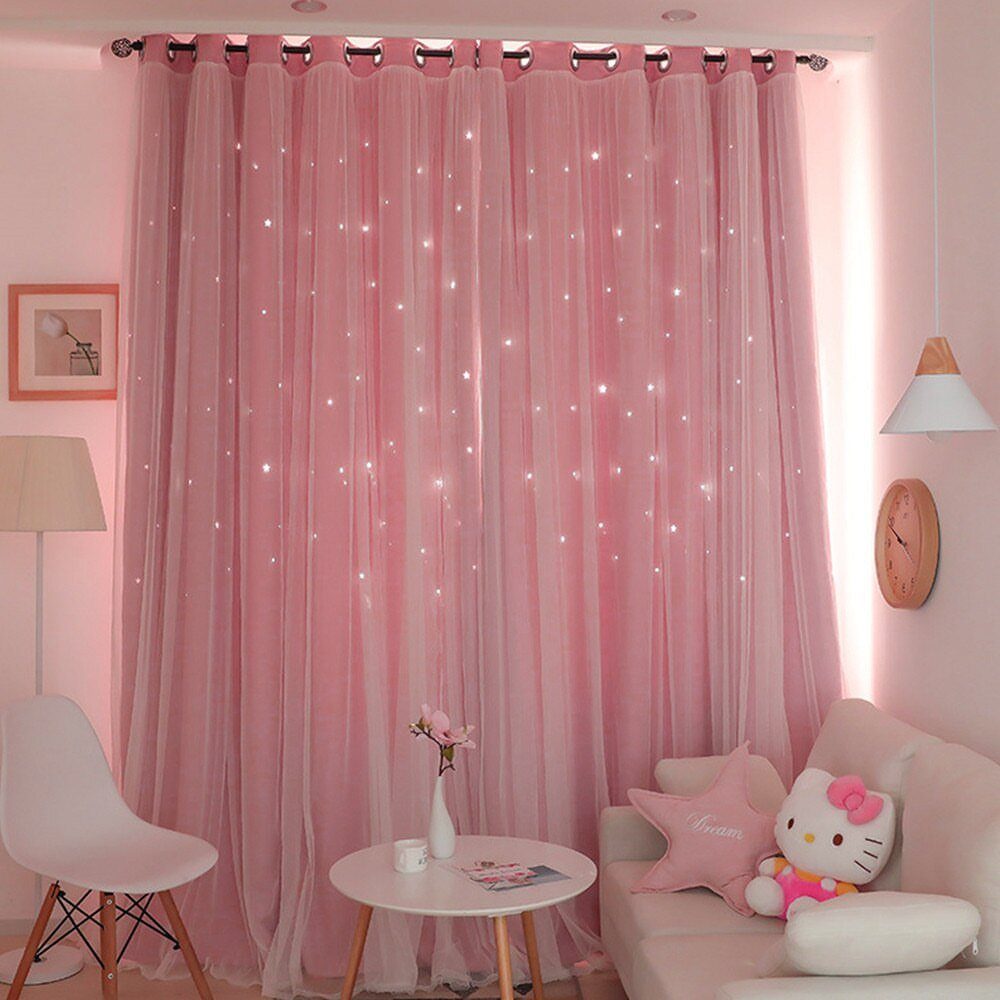
Pink sheers over white works anywhere you want softness without sweetness. I would skip the cutouts for a living room and keep the overlay; the layering is what gives the color its depth.
Pink sheer reads differently than pink opaque.
Opaque pink can go bubblegum fast; sheer stays in the blush range because light diffuses through it. If your walls are already warm white or cream, this adds color without demanding new throw pillows to match it.
5. Earthy Brown and Cream
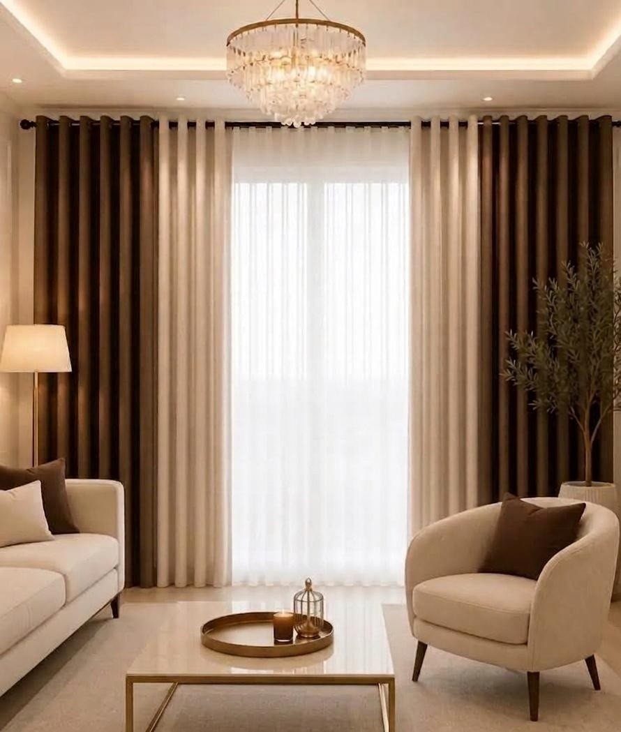
Brown and cream together settle a room faster than almost any other pairing I know. The brown grounds, the cream lifts, and neither competes with wood furniture or wood floors the way gray sometimes can.
Layered panels with sheers behind mean you adjust for the hour, not the season.
Morning coffee with sheers only; evening with the browns drawn against streetlights. The chandelier in this room is doing its own work, but the curtains are what make it feel lit from within rather than staged.
For this look on a budget, I would buy cream sheers and brown cotton panels from IKEA’s HILJA or MAJGULL lines and mix widths until the stackback covers the wall adequately.
6. Blush Curtains
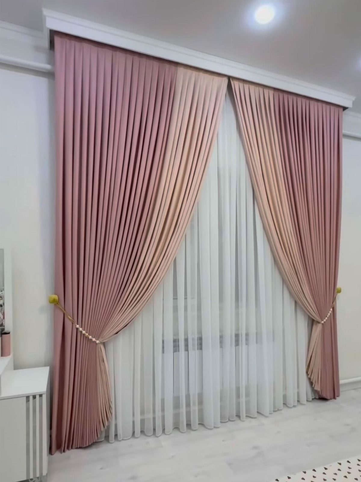
The gold in the tie-backs is doing specific work here; without it, the pink could read as unfinished.
Pleating costs more than rod pocket, with extra fabric and often custom work.
For a rental or first home, I would fake the pleat with ring clips spaced close together and a light steam. The effect holds from the street, which is where most people see your curtains anyway.
Dusty pink specifically, not bright pink, is what keeps this adult. If the swatch looks like a ballet slipper, go one shade grayer.
7. Yellow Curtains
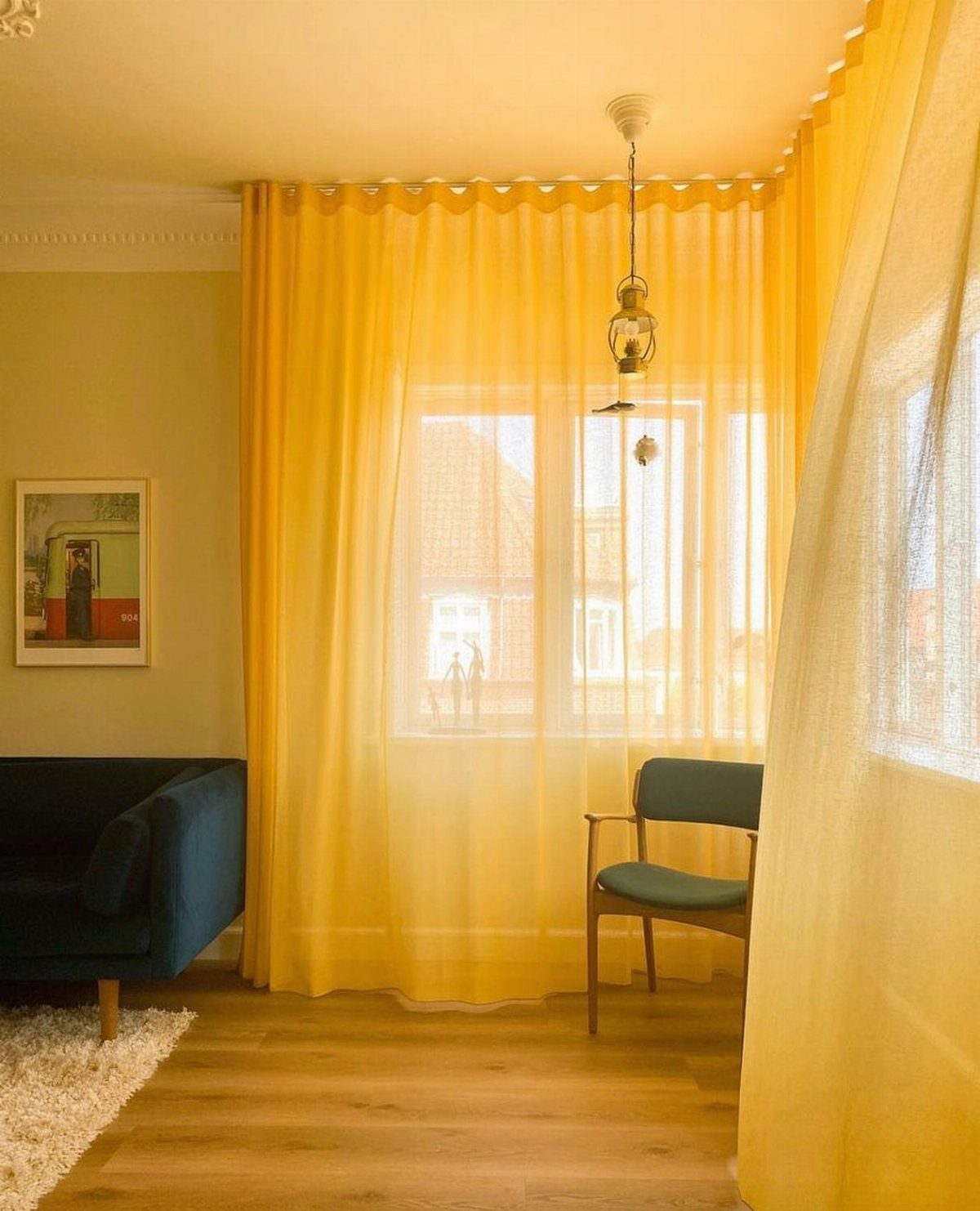
Sheer yellow turns a room into morning even on gray afternoons. I like this for north-facing spaces where natural light is scarce; the curtain does some of the sun’s work.
Yellow works best when everything else stays quiet.
Dark sofa, light wood, nothing else competing for attention. Yellow this bright becomes the accent the room builds around, so you need only one.
8. Grey and Yellow
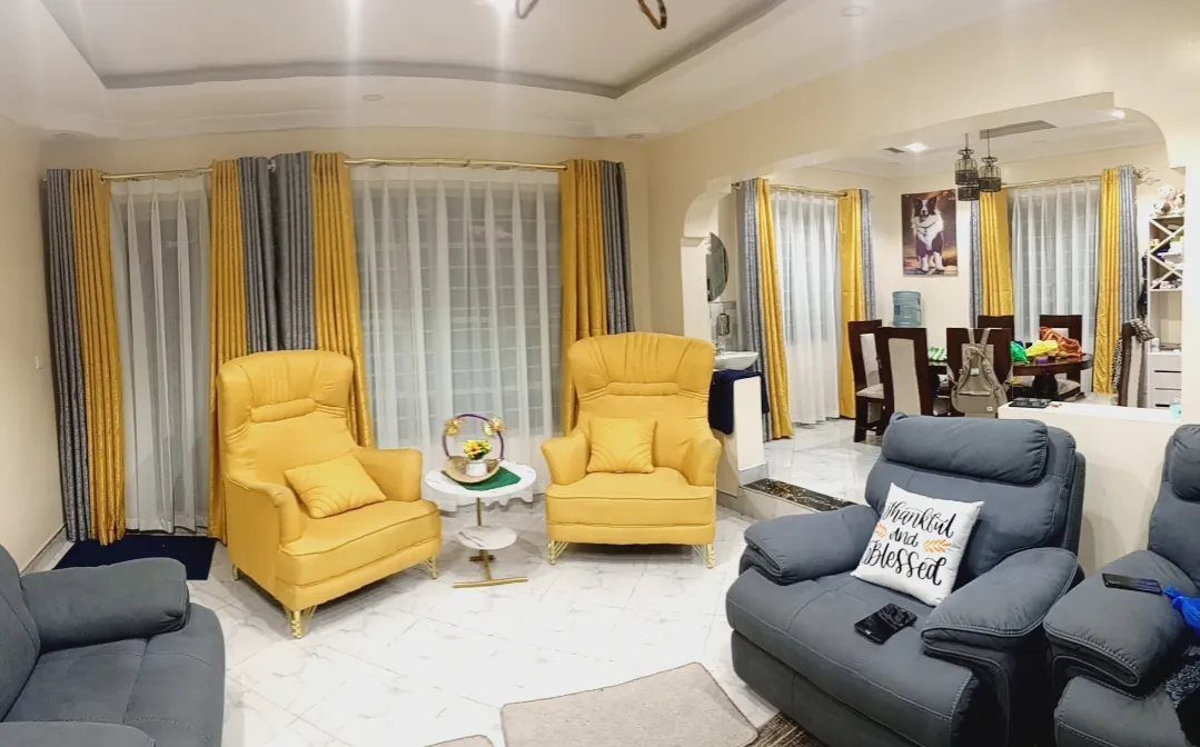
2 colors this strong need equal footing to work. The chairs carry yellow, the recliners carry grey, and the curtains split the difference so neither shade feels like an afterthought.
I would copy this balance rather than the exact pieces.
A grey sofa with yellow curtains works the same way; so does yellow bedding against grey walls. The pillow text is doing sentimental work that I would skip, but the color math is solid.
9. Luxe Linen Blend Woven Curtain
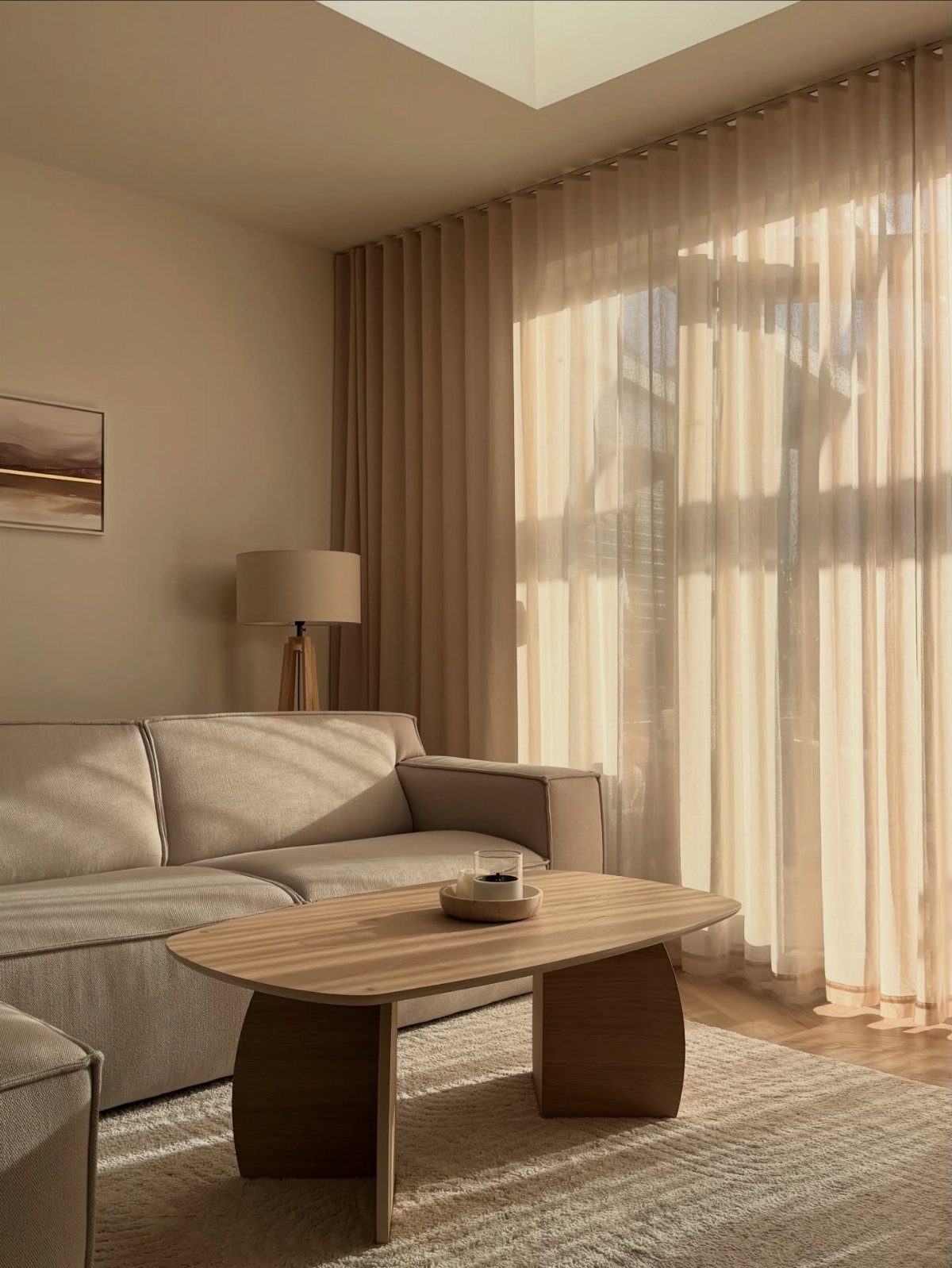
Raw edge and loose weave read as expensive because they look unfinished on purpose. That only works in a room already calm enough to carry it; too many patterns nearby and the curtain looks like you forgot to hem it.
The viscose in the blend gives the linen weight it lacks on its own.
Pure linen sheers blow around and tangle in the rod; this mix settles. For a similar effect cheaper, West Elm’s Belgian Flax line runs lighter but hangs with the same looseness.
10. Playful & Vibrant: Adding Personality
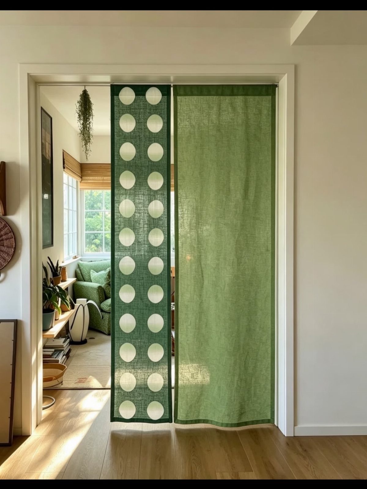
Doorway panels instead of a door suit rentals where you cannot change the frame. The solid panel gives privacy, the dotted one gives light and a view through; together they replace what a door would block.
I would use tension rods and pocket headings so the whole setup moves with you.
Pattern this large needs space to read; small windows turn the dots into noise. The sitting room beyond is doing half the work, giving your eye somewhere to rest.
11. Green Drapes
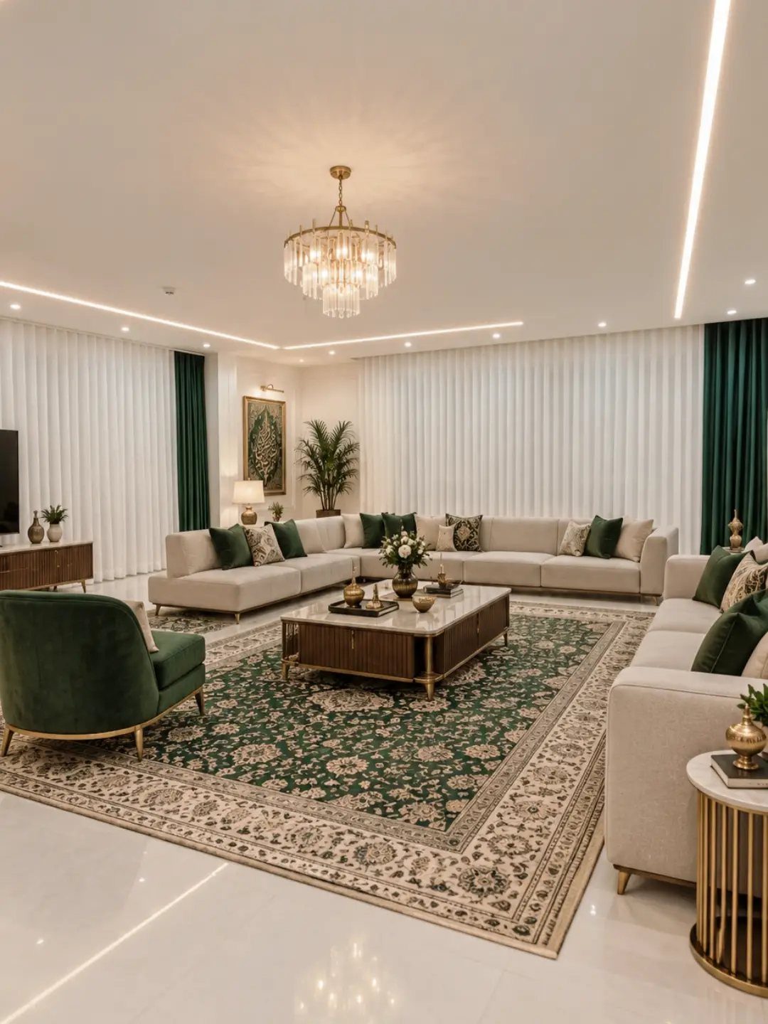
Dark green velvet against cream reads as intention, not accident. The armchair matches the drapes, which is the trick: one strong color repeated once, never scattered.
The green functions as a frame you can open, and in a layered setup a sheer white behind would let you filter light without losing the color.
I would hang these wider than the window itself so the pulled-back stack shows solid color against wall, not a slice of glass. The walls are busy; the curtains win by staying plain.
12. Red Curtains
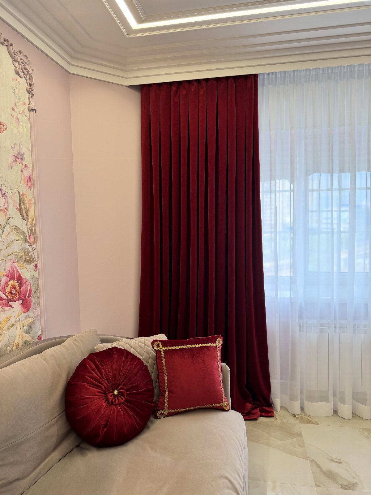
Red velvet this deep needs sheer white beside it or the room turns theatrical. The 2 pillows echo the curtain color, which is just enough repetition; more red would tip into themed decor.
Velvet photographs lighter than it reads in person. Order swatches and check at the hour you actually use the room.
I find red velvet goes burgundy in low light and bright in sun; both are fine, but they are different colors, and you should know which you are getting.
13. Black and White Curtains
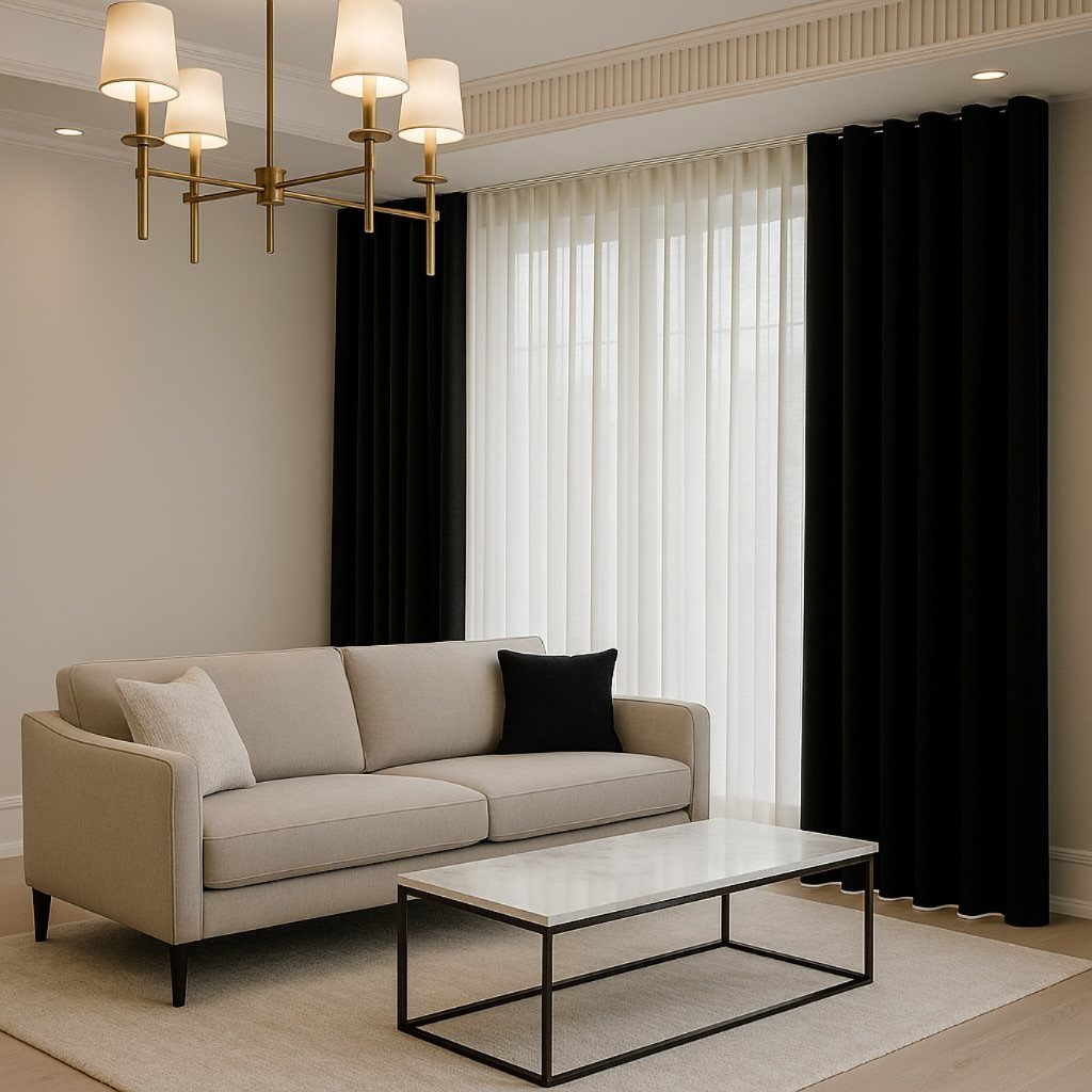
Black panels over white sheers give you two moods in one window. I would hang the black wide enough to stack completely clear of the glass when open; otherwise the room halves its light permanently.
The brass chandelier and marble table in this room keep the black from reading as gothic. Warm metal elsewhere is what lets black curtains live in a normal house, not just a staged one.
If your hardware is chrome or black already, swap the finials or add one brass lamp before you commit to drapes this dark.
14. Maroon Curtains with Gold Accents
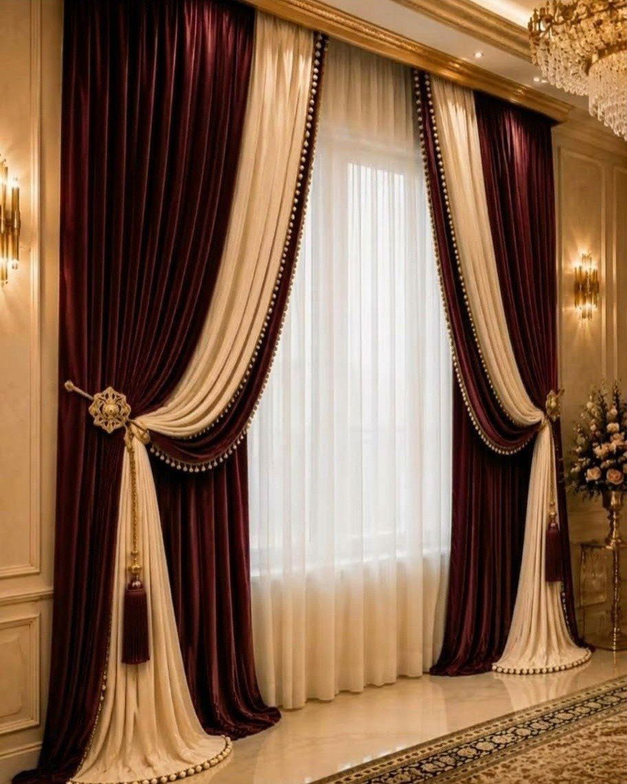
Maroon velvet with gold trim is the one idea on this list I would not DIY. The beaded edge and tasseled holdbacks need proper workrooms; home machines tangle on trim this heavy.
The cream band at the inner edge keeps the maroon from swallowing the window whole. I notice the sheer white behind is doing the actual light work; these panels are frame, not function.
For a similar effect without the formality, plain maroon cotton panels and brass curtain rings from a hardware store give you the color pairing at a fraction. Skip the tassels.
Choosing Curtain Colors
Mood comes first. A room you want to feel open needs sheers in cotton or linen; a room you want to feel held needs velvet in deep tone.
The light a room gets should narrow your choice, not complicate it. Sun-filled spaces do well with sheers that soften without blocking; bedrooms and media rooms need blackout weight in navy, black, or deep gray.
Neutrals pay off if you change decor often or move between rentals. Beige, taupe, and light gray survive new sofas and new wall colors without demanding replacement.
Curtains are one of those deceptively influential details. They may seem like a background player, but the color you choose can dramatically shift the tone of a room – making it feel current and curated, or dated and flat.
Curtain Fabrics
Sheer fabric in a light color keeps a room feeling open because it filters light instead of blocking it. Velvet adds depth and suits darker walls or formal rooms; it also blocks light and sound better than open weaves.
Linen and cotton hang with a natural looseness that works in earthy palettes. A lightweight curtain with heavier lining behind it gives you both moods without buying 2 sets of hardware.
Layering Curtains
Layering solves more problems than any single panel can. The same setup in reverse lets you soften harsh morning light while keeping the heavier panel ready for evening.
Each layer needs its own space to register: a pattern has to breathe, and a solid color needs enough width past the frame so the stacked fabric sits against the wall, not the glass.
Frequently Asked Questions
What color curtains look best on white walls?
Beige, gray, and soft pastels layer softly against white without fighting it. Beige works especially well in rentals because it adds warmth to the flat white or cool gray walls landlords usually leave you with.
White or off-white sheers keep the room airy if you want minimal contrast, while black panels give you graphic depth in a modern space.
What are the best curtains?
The best curtain depends on the mood you want and the light the room gets. A lighter face fabric with a heavier lining behind it lets you shift between filtered daylight and real darkness without installing a second rod.
What are some good curtain ideas for a small living room?
Pale tones, white, beige, or light gray, bounce what light you have around a small room instead of swallowing it.
Sheer fabrics maximize what light you have, and floor-to-ceiling height with panels that skim the floor adds presence without adding square footage. I would avoid heavy patterns on small windows; they turn to noise instead of reading as design.
What color curtains are on trend?
Warm neutrals and desaturated jewel tones are where the shift is heading. Burnt orange, ochre, moody navy, and olive green replace the brighter reds, yellows, and blues that read as harsh now.
I notice linen and cotton in these tones showing up more, partly because they are easy to live with and partly because they photograph the way people actually want their rooms to feel.