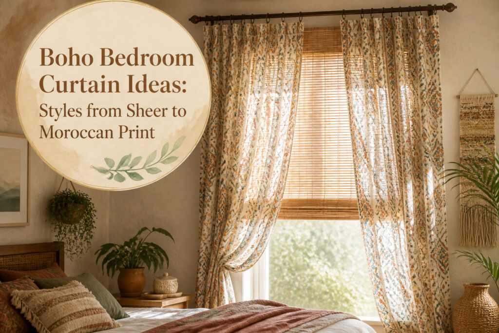
Boho bedroom curtains run from $40 hand-printed cotton to estate-sale vintage finds, and the difference that matters is not price but layering: one quiet layer plus one that moves. Get that wrong and even the right print turns into visual noise.
The setup that keeps working is a bamboo shade inside the frame and patterned cotton on a second rod set forward, so each layer has a clear job.
1. Sheer Curtains
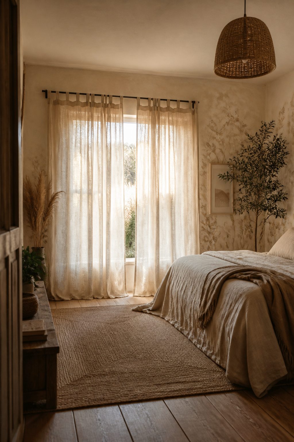
Sheer curtains are where a boho bedroom starts, not where it finishes.
Cotton and linen sheers filter morning light into something soft enough to wake up to without turning the room into a greenhouse, and the drape stays loose in a way synthetic fabrics never manage.
That breathability matters more than it sounds like it would; stiff panels read as costume, and boho leans on the feeling that everything settled there naturally.
The real payoff comes from treating sheers as a first layer. A heavier curtain with a Moroccan print or block pattern hung in front gives you privacy after dark without giving up the daylight openness that makes the style work.
The sheers stay on the rod full-time, the outer panels do the seasonal work, and the combination costs less than one thick custom set.
Linen and cotton both age better than you’d expect, softening further rather than looking worn, which fits a style built on things that look collected over time rather than bought in a set.
For renters especially, this setup travels well. Two tension rods, two layers, no hardware in the wall, and the room still feels finished by Sunday evening.

Basic Information: Includes 2 curtain panels, each measuring 50 inches wide for a total of 100 inches. Easy care for machine washable in cold water, do not bleach, tumble dry low, iron on low heat if needed.

Thick Linen Fabric: These linen curtains are carefully crafted from 400 GSM fabric of flax linen, cotton and polyester, offering a blend of softness, natural aesthetics and durability. Thicker linen curtains capture a real rich flax textured feel while savoring a heavier set,adding a touch of sophistication

✿Ready Made Window Curtains : Package includes 2 Boho Window Curtain panels, each measuring 52"W & 63"L . Rod Pocket design, easy to install and slide. Refresh your space with the soft look and peaceful feel of our curtains
2. Macrame Curtains
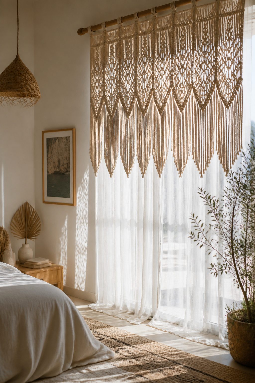
A macrame panel works best when you treat it as art that happens to hang in a window.
The knotted cotton or jute catches morning light and throws lace-like shadows across white walls, which is where the texture pays off most.
Against bare plaster or a neutral headboard, it reads as a deliberate layer rather than a missed opportunity for real curtains.
Privacy is the tradeoff. A full macrame curtain leaves the glass more exposed than fabric would, so the placement matters.
I have seen these work well as a valance over a shorter sheer, or hung across a doorway where the bedroom divides from a closet or bath.
The point is to put it where light still moves through and the view behind it is not the one you are trying to hide.
The handmade quality is what sells the boho look here. Machine-knotted versions exist, but the slight irregularity of hand-tied cord is what keeps the room from feeling like a catalog spread.
If the wall behind it is already busy with shelves or prints, a simpler knot pattern keeps the eye from tiring. A plain wall and an intricate panel is the combination that actually reads.

100% Blackout Roller Shade: Made of polyester fabric coated with blackout backing. Blocking out 100% light for complete privacy, light control and UV protection for bedrooms, children’s rooms and movie rooms. Excellent for deeper and longer sleepers.

Inside Mount ONLY. For better internal installation, a standard 3/8 inch deduction is made to the shade width. The actual blind size is 34 1/8" W x 64" H, the metal brackets at both ends can extend 1 inch in total, allow the blind to fit for window width 34.2-35.2 inch. (Pls Note) Minimum 1 1/2" depth of window frame required for inside mount.

Important Note for Inside Mount Measurement:The size of this bamboo roman shade is exactly as ordered – no factory reduction. For a 34" W bamboo blinds, the inside width of your window frame should be between 34.375"–35". Please refer to the included measurement guide for accurate sizing and perfect light filtering coverage
3. Floral Patterned Curtains
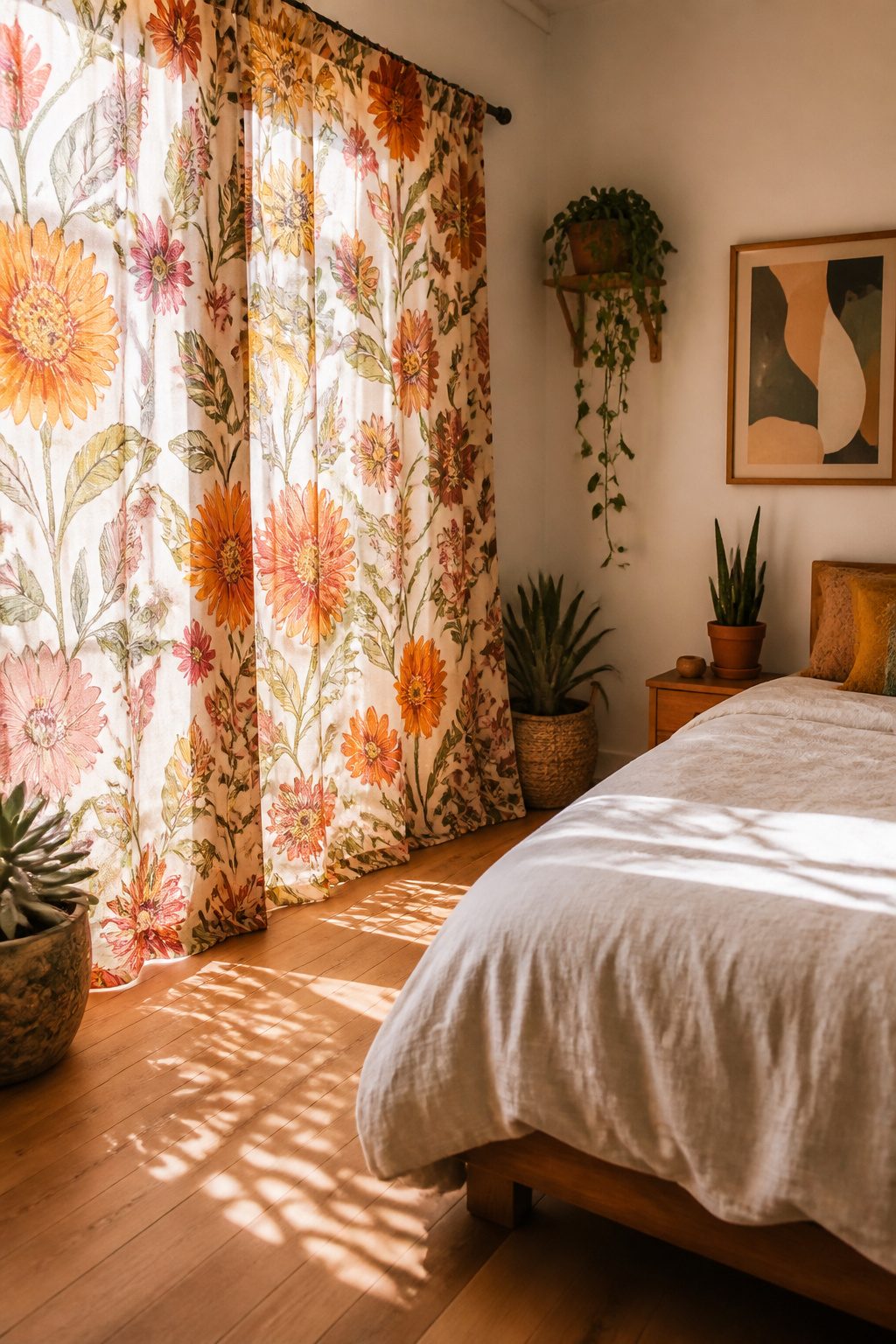
Floral prints show up in almost every roundup of boho curtain ideas for a reason that has nothing to do with trends. The term "flower child" emerged from the same era that shaped bohemian style, and that connection still holds.
A floral curtain reads as intentional in this context, not decorative for its own sake.
The scale of the print changes what the curtain does in the room. Oversized blooms become the single "hero feature" that the rest of the space works around.
Scattered smaller florals read as texture from a distance and only reveal their detail up close. Both work, but they ask for different companions.
An oversized print against a busy rug fights for attention; the same print against a solid bedspread or a seagrass tone has room to breathe.
Color density matters more than color itself. A vibrant floral on neutral walls adds depth without clutter.
A muted floral can layer with other patterns, though in a bedroom I would keep that layering to the bedding or a single rug, not both.
The curtain often ends up anchoring the palette because it carries the most colors in one place: pull the wall tone from the lightest shade in the print, the accent from the deepest, and the room holds together without matching too carefully.
I have seen the "more is more" advice applied literally, with competing florals on curtains, pillows, and bedcover all at once. The result was a room that felt designed to photograph, not to sleep in.
One strong floral print, solid everything else, and the space actually lives like a bedroom.

COMPLETE 4-PIECE SET – Obsluvela curtain set includes 4 panels: 2 solid room darkening curtains and 2 Moroccan lantern-print sheer curtains. Use them together for a stylish layered look, or hang them separately to match your room and lighting needs. The elegant solid panels paired with boho-inspired printed sheers bring soft texture, privacy, and decorative charm to bedrooms, living rooms, dining rooms, or home offices
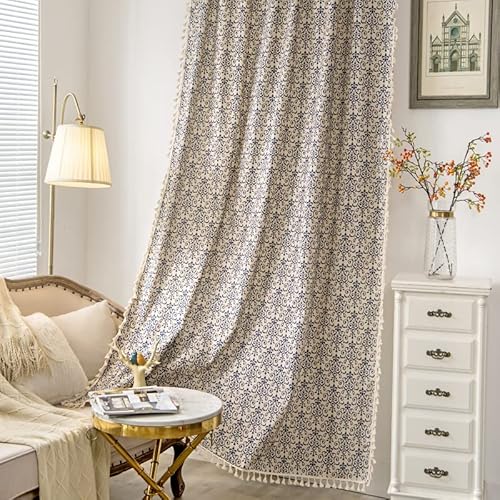
【Ready Made Curtain】Each package contains 1 panel bohemian curtain. The boho curtain is made of high-grade 90% cotton hemp blended 10% linen fabric, each panel size measures width 59" by length 84". Top rod pocket design fits up to 3’’ curtain rod for hanging.

Distressed Design:Jacquard woven of colored yarn on greyish white fabric to create a color block two tone contrast,these drapes surely add depth and sophistication to your room.Especially well compliment your similar distressed area rugs and pillow covers.
4. Block Printed Curtains
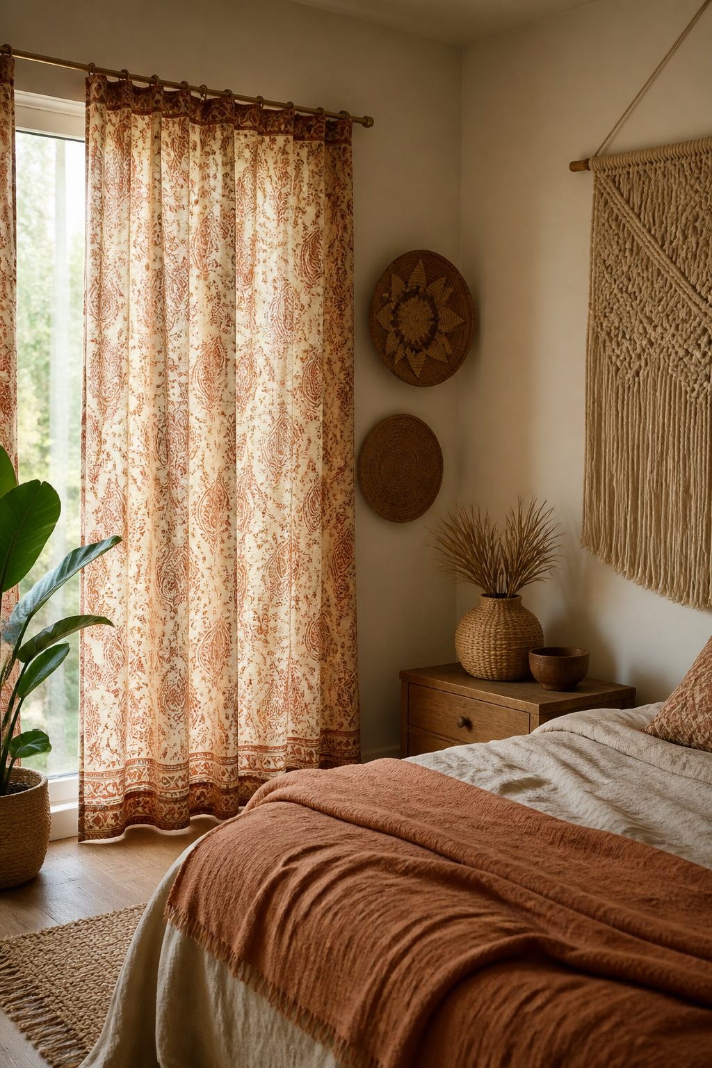
Block printed curtains carry the slight irregularities that machine rollers work hard to erase.
A paisley or geometric floral from a hand-carved block sits a little off-register, the pigment thicker in one corner, and that unevenness reads as warmth the second you step into the room.
The motifs pull from Indian and Moroccan traditions: teardrop paisleys rooted in Rajasthani workshops, repeating diamond florals that echo Fes tilework. What separates these from standard floral prints is the texture pressed into the cotton itself.
The block leaves a faint relief, almost like a bruise in the weave, that catches sideways light and keeps the pattern from flattening into wallpaper.
Pair block prints with bamboo shades or a plain wall so the irregularity becomes the point rather than noise. The craft is the decoration; adding more pattern on top just competes with the handwork.

Set of 2: Macrame curtains panels includes 2 handmade khaki macrame curtain panels with woven fringe details, creating a cozy boho decor and farmhouse decor style for living room decor, bedroom decor, apartment decor, studio decor, and neutral home decor.

Macrame Curtains: Bring the boho aesthetic into your home with the Lush Decor Boho Macrame Tassel Cotton Window Curtain Panel. These boho curtains for windows are hand-knotted, arranged in a diamond pattern with tassels, adding dimension to your space.

【Unique Craftsmanship】:Macrame curtain after hours of handmade knotting, the use of cotton material gives it a minimalist feel and creates a relaxing feel in the room.
5. Tassel-Trimmed Curtains
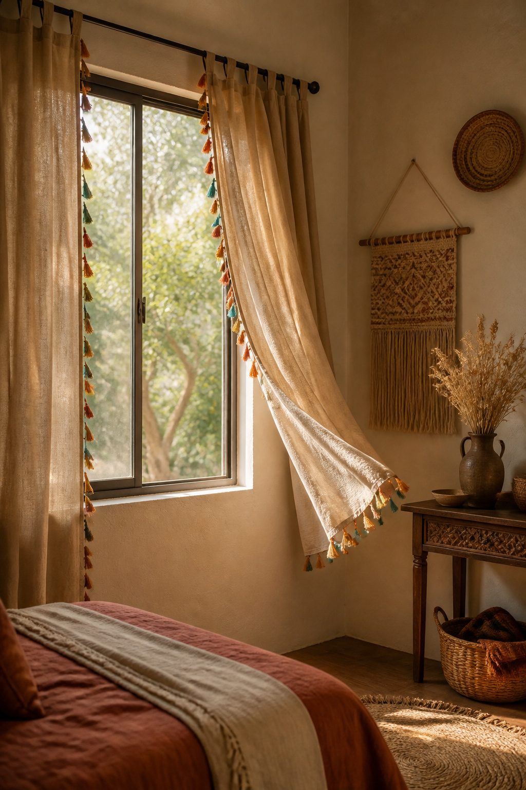
Tassels turn a plain curtain panel into something that moves. The trim can sit along the leading edge, run across the bottom hem, or frame the whole panel, and each placement reads differently.
Edge trim draws the eye when the panels are drawn back; bottom trim pools and drifts when they hang straight.
The real payoff is motion. Tassels catch air from a window or a ceiling fan, so the curtain keeps doing something after you have walked away.
Light hits the threads at different angles through the day, which keeps a solid-colored panel from going flat.
If the room already has tasseled pillows or a throw, repeating that detail on the curtains ties the pieces together without matching them exactly. The texture layer is what keeps boho from looking like a generic beige room.
A tassel trim gives a handcrafted, artisanal feel that reads as global and collected rather than bought as a set.
Ivory tassels on ivory drapes stay understated; the same trim on a darker panel turns dramatic. The key is balance.
Let the tassels complement the base fabric rather than fight it. A thin trim on a busy print will disappear; a heavy fringe on an already textured weave can look like too many competing stories.

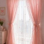
【Floral Printed Curtains】Floral curtains features a beautiful mix of soft pinks and fresh green botanical patterns. Beige tassels add a charming finishing touch and decorative touch blends Cottagecore, Farmhouse, Boho styles, creating an aged and elegant.

Boho Floral Semi Blackout Curtains: Country curtains with birds floral prints and delicate patterns bring timeless charm and artistic character. Living room curtains with whimsical bird accents create a lively and uplifting atmosphere. Rich color depth and subtle sheen brighten rooms and add visual interest.
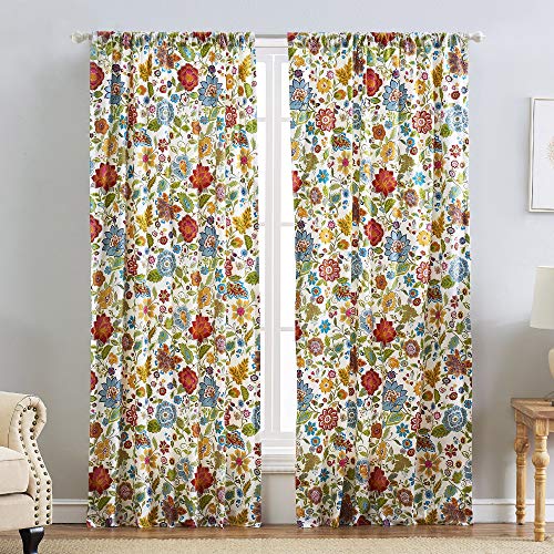
COMPLETE 4-PIECE SET INCLUDES 2 panels and 2 tiebacks
6. Earthy Tone Curtains
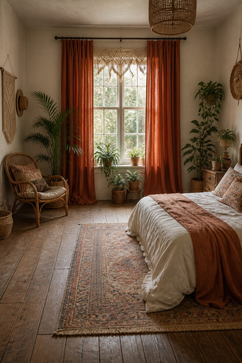
Solid curtains in terracotta, sage green, mustard, or cream do the quiet work of holding a boho bedroom together.
I learned this the hard way after hanging a pair of busy block-printed panels on every window in my first apartment; the room felt like a textile shop exploding, not a place to sleep.
Earth tone curtains give the eye somewhere to rest so the macrame, the patterns, and the collected clutter elsewhere can actually read as intentional.
Natural dyes or undyed fabrics carry the look further than saturated primaries ever could.
A terracotta cotton curtain layered with a macrame valance, or sage linen coupled with bamboo shades, delivers that curated yet effortless feel because the color already looks weathered and found. Primaries fight the room; these tones settle into it.
The palette also needs restraint, since too many different colors mixed together will clutter the space even if every single one is "earthy." I stick to one grounding color for the curtains and let the rest of the room wander.

Versatile Hanging Options: Set of 2 Panels.Each panel measures 52 inches wide by 90 inches long, with a back tab and loop pocket top design that provides three hanging options: an elegant pleated look from the back patch, a classic gathered effect with rod pocket style, or the ability to hang with clip rings (not included).

Boho Floral Semi Blackout Curtains: Country curtains with birds floral prints and delicate patterns bring timeless charm and artistic character. Living room curtains with whimsical bird accents create a lively and uplifting atmosphere. Rich color depth and subtle sheen brighten rooms and add visual interest.

Basic Information: 2 LINEN PANELS in 1 package. Each panel measures width 52 x 84 length. 3-Way Hanging Options: Hang these curtain panels (1) using the back loops to create an elegant pleated effect, (2) from the 3 inch rod pocket for a classic look, or (3) using clip rings for easy, slide open and closed (clip rings are not included)
7. Gingham Curtains
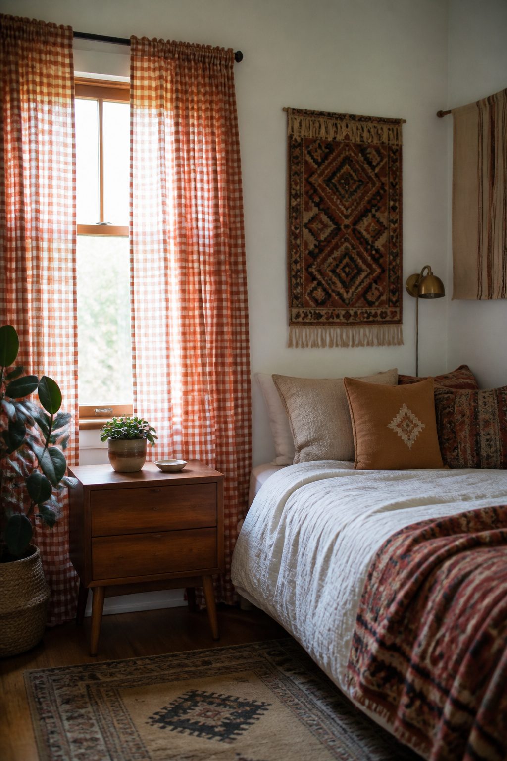
Gingham reads quieter than the usual boho suspects, but the handmade history is what keeps it in the conversation.
Small-scale checks feel like something you could have sewn yourself, which matters when the whole point is a room that looks collected rather than bought.
Buffalo check at window scale turns graphic fast, and not every bedroom can handle that much grid.
The smaller the repeat, the more it behaves like a texture, which is usually what you want behind a bed with a lot else going on.
Color moves this out of farmhouse-only territory. Navy and cream, olive and natural, even a faded rust against unbleached cotton all read more "found at a flea market" than "country kitchen."
The rust pairing especially plays well against rattan or a vintage textile on the wall.
Farmhouse-boho crossover is where gingham earns its keep. If your furniture runs cleaner-lined and your walls are white, gingham keeps the room from feeling like a showroom floor.
Hang it unlined so it filters light like a gauze curtain would, and the homespun reference stays without the full picnic-table effect.

REAL WOVEN BAMBOO CONSTRUCTION: Authentic natural bamboo fibers create a warm, textured roman shade with genuine tonal variation in every panel. Adds organic texture to modern organic, boho, coastal, farmhouse, and rustic rooms at an everyday price.

REAL WOVEN BAMBOO CONSTRUCTION: Authentic natural bamboo fibers create a warm, textured roman shade with genuine tonal variation in every panel. Adds organic texture to modern organic, boho, coastal, farmhouse, and rustic rooms at an everyday price.
8. Vintage Curtains
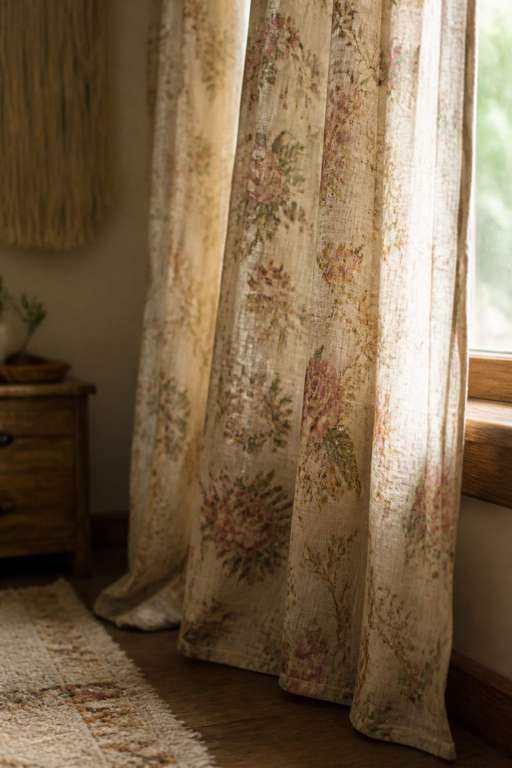
Actual vintage curtains carry a weight that reproduction prints never quite match, though finding them takes patience and a willingness to sort through musty bins.
Estate sales in older neighborhoods tend to yield the best 1970s panels, the kind with oversized geometric or botanical prints in mustard and rust that read instantly boho.
Thrift stores near retirement communities often turn up 1940s florals on cotton or early rayon, softer in color but just as useful layered over a plain liner.
Condition matters less than you might think. Faded edges can be trimmed and hemmed; a small stain near the bottom hem hides behind a bed frame.
Skip anything with dry rot along the folds or missing header tape, since that structural damage is not worth repairing on a weekend timeline.
Weak seams, on the other hand, are a quick fix with a sewing machine or even hand-stitching.
The real challenge is width. Vintage panels were made for narrower windows, and modern frames often need fifty percent more fabric.
Two matching pairs can be seamed into wider panels, with the join placed at the outer edge where draping hides it.
A single wide panel can be cut down the center, the edges finished, and the halves hung as a pair.
Either approach costs a few dollars in thread and an hour of work, against thirty or more for new boho-style curtains that will not have the same worn-in drape.

READY MADE: Two panels per package, each panel measures 52 inches width by 95 inches length.

READY MADE: Two panels per package, each panel measures 52 inches width by 84 inches length.

*Sold as Pair*: Package includes 2 panels of Moroccan fashion curtains + 2 matching tiebacks, each measures 52"Wx84"L (total 104" wide for 2 panels, our length is from the very top of the curtain to the bottom hem).
9. Moroccan Patterned Curtains
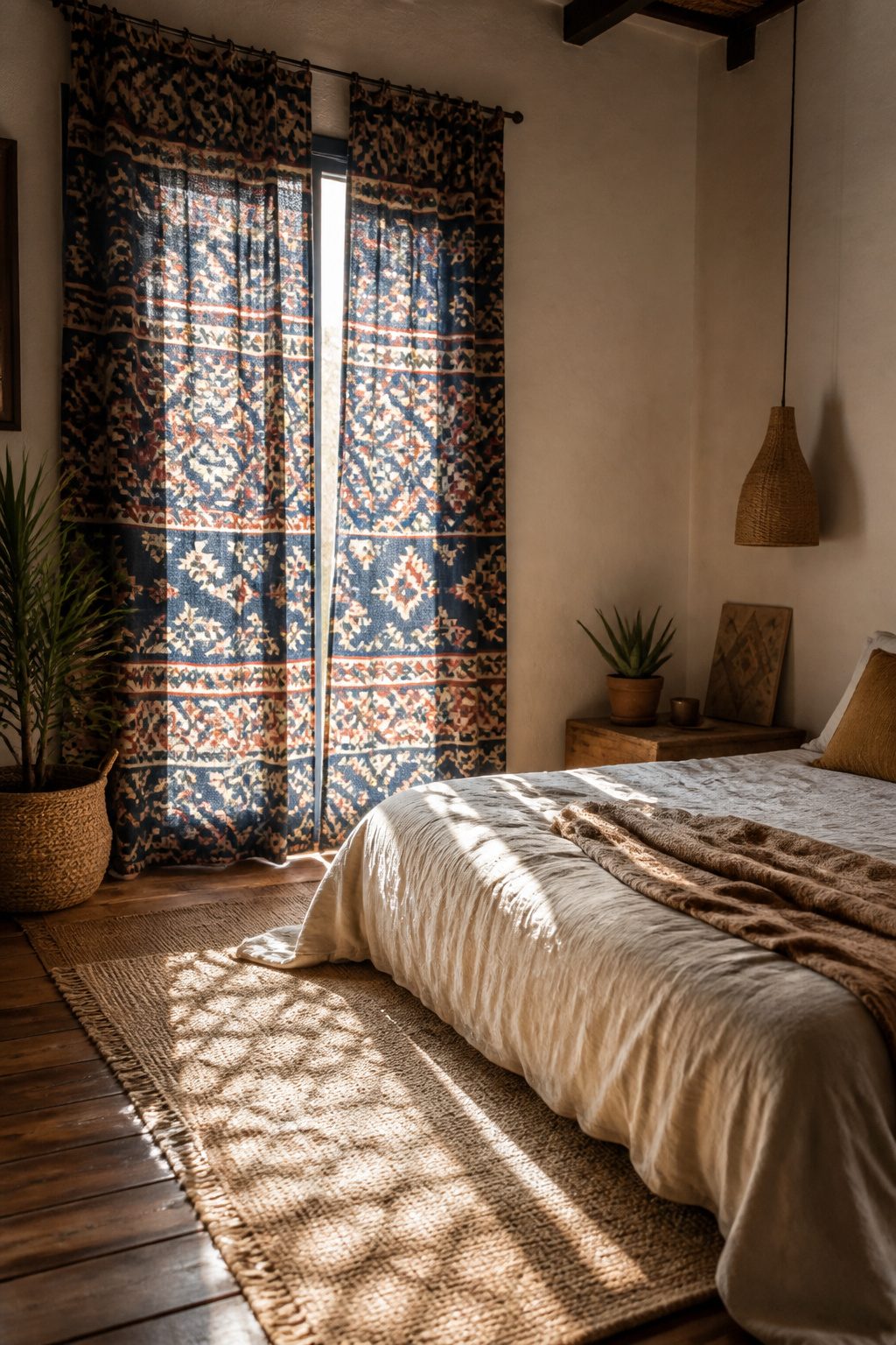
Geometric tile-inspired prints carry a different energy than the florals that dominate most boho curtain talk.
The structure is rigid, the repetition exact: navy and white or terracotta and cream locked into grids that read more Marrakech garden wall than English cottage. That discipline means boldness demands simpler companions, not competing patterns.
I learned this ordering curtains for a narrow bedroom where the window sat opposite the bed. The tile print became the focal point from the doorway, but the bed itself stayed plain: oatmeal linen, no competing throw pillows.
Behind the bed as a full wall, the same print would work if the rest of the room stayed quiet enough to let it read as intentional architecture rather than visual shouting.
The block-printed versions from Rajasthan run $44.00–$76.50 on sale, which puts them in reach for a weekend project without the guilt of a splurge.
What sold me, reading through the options, was the fair-trade angle: hand-printed means slight variation panel to panel, enough to keep the geometric from feeling machine-stamped sterile. For a renter, these carry the room without the commitment of wallpaper.


100% Natural Cotton Handwoven:This macrame curtain is handwoven with 100% natural cotton rope, with each rope carefully knotted to create a unique vintage tassel pattern, showcasing a beautiful boho curtain style. More than just a window covering, it doubles as a macrame wall hanging, fiber art, and macrame wall decor, adding a handcrafted artistic touch to any room.

Natural Cotton Style Bohemian Curtains: These boho lace curtains are made from a cotton blend (55% Cotton, 45% Polyamide fiber), featuring an elegant crochet design with intricate geometric patterns, adding a unique vintage touch to your home decor. Perfect for creating a chic and cozy vibe.
10. Beaded Valance
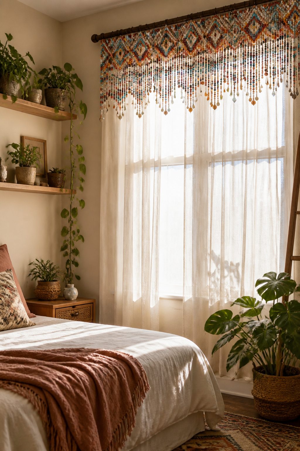
A beaded valance sits at the top third of the window, doing the decorative work without pretending to be a curtain.
Wood, shell, and acrylic beads each throw a different shadow pattern across the sill when morning light hits them, and that shifting texture is the whole point.
Shell beads cast the sharpest, most scattered light, while wood softens to something closer to dappled shade.
This is a top treatment, not coverage, so it pairs with something functional beneath. Sheers keep the bohemian feel without competing, or a solid panel in linen or cotton gives you the blackout you need for sleeping.
The valance itself does not block light, does not insulate, and offers zero privacy. Anyone walking past at night sees straight in.
Renters often hang a beaded valance from a tension rod inside the frame, then layer a longer curtain on a second rod.
That setup lets you take both with you, and the holes from the tension rods are easier to patch than drilled brackets.
For a weekend project, the math is simple: measure your window width, add a few inches for the beads to hang in soft gathers, and expect to spend under forty dollars if you source the strands yourself rather than buying pre-assembled.

【Floral Printed Curtains】Floral curtains features a beautiful mix of soft pinks and fresh green botanical patterns. Beige tassels add a charming finishing touch and decorative touch blends Cottagecore, Farmhouse, Boho styles, creating an aged and elegant.

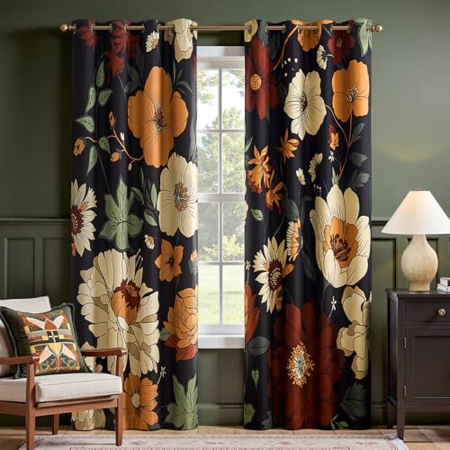
Interlocking Patterns: Each panel features a unique vintage floral print that seamlessly connects to form a complete artwork when joined together. The mid-century bohemian aesthetic is embraced through the vibrant floral patterns of these curtains, bringing life and color to any room
11. Bold Patterned Curtains
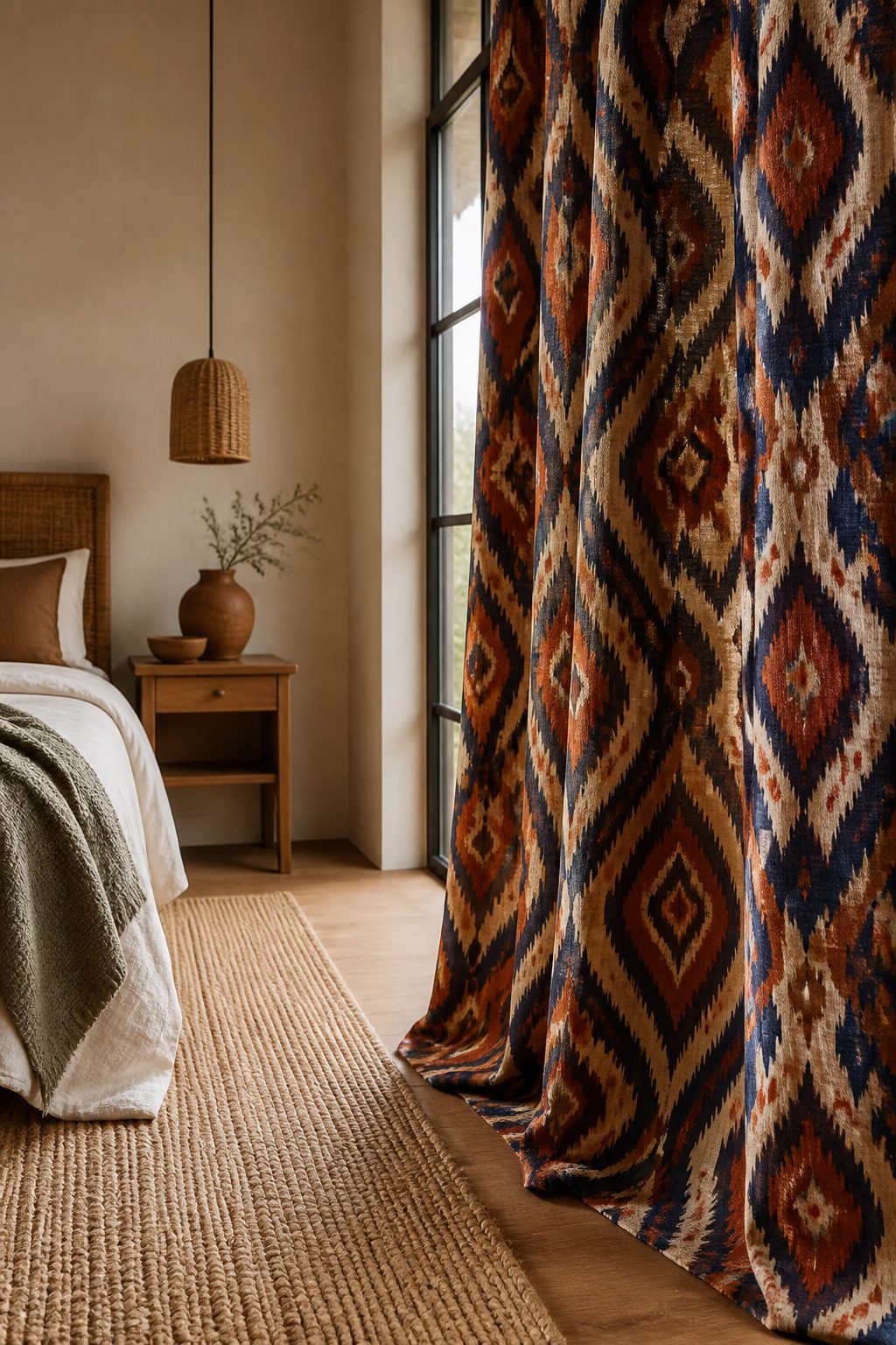
Large-scale prints with paisley or ikat motifs can carry a whole bedroom if you let them. The mistake is treating them like wallpaper and adding competing patterns everywhere else.
What worked in the space I studied was one dominant curtain against burnt sienna walls, with the pattern’s earthy tones picked up again in a single rug or solid bedding.
That repetition, not variety, keeps the room from feeling like a clearance rack.
One bold curtain is usually enough. Layering two bold patterns successfully takes a formula: pair the louder print with something structural and quiet, like a bamboo shade, so each element has a clear job.
A patterned cotton curtain over that natural base reads intentional; two competing prints on the same rod read accidental.
If you do want double patterns, keep them in the same color family and differ the scale, one large and one small, so the eye rests somewhere.
12. Double-Layered Curtains
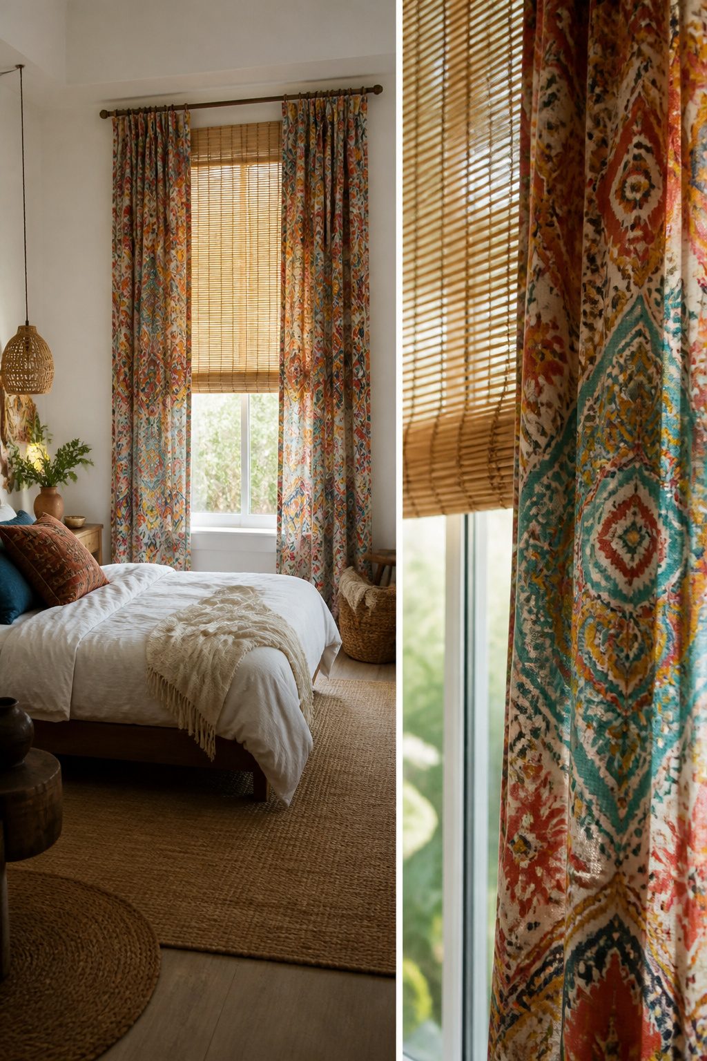
Bamboo shades paired with patterned cotton curtains are the combination that keeps showing up in rooms that actually work. The shade handles the practical job: it blocks light and gives you privacy at night.
The curtain layer adds the softness and the print that reads as boho rather than bare window.
What makes this look intentional instead of accidental is the spacing. You need two separate mounting points, not one crowded rod trying to do both jobs.
A slim bracket-mounted rod for the curtains, set a few inches forward of the shade, keeps each layer distinct.
The shade sits inside the frame or just above it; the rod goes wider, near the ceiling if the room allows it.
Patterned cotton brings in the global influence that the style calls for, and the natural tone of the bamboo keeps that pattern from floating untethered. Together they read as a formula someone chose, not fabric someone accumulated.
That distinction is what separates styled from messy in a small bedroom where every layer shows.
What Boho Actually Means for Windows
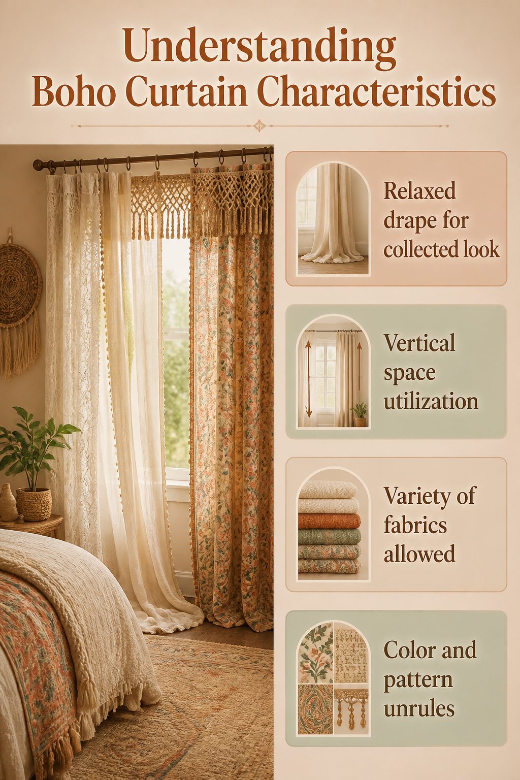
Boho curtains work because they borrow the logic of a travel trunk: layers picked up in different places, none of them bought to match, but held together by a shared looseness. The hang matters as much as the fabric.
A relaxed drape that pools slightly on the floor reads collected; a crisp, tailored break at the sill reads hotel room. That difference is where the style lives or dies.
The window carries weight in a boho bedroom because the bed itself limits what else you can layer. You are not stacking rugs on the bed or hanging tapestries over the headboard without looking like you are trying too hard.
Curtains, though, take vertical space the bed cannot touch, and they move: gauzy linens that shift with a breeze, handwoven panels that read like market finds, trims that catch light differently through the day.
They do the work of ten smaller objects.
Color and pattern follow the same unrule. Moroccan prints, Indian block prints, vintage florals, nature motifs: the sources describe all of them as fair game, and the common thread is that no single panel needs to carry the room.
The identity builds from pairing, from the slight clash of a beaded valance against a printed panel, from the confidence to stop before it turns cluttered. The formula is real, but it is a formula for layering, not for matching.
Layering Without Clutter
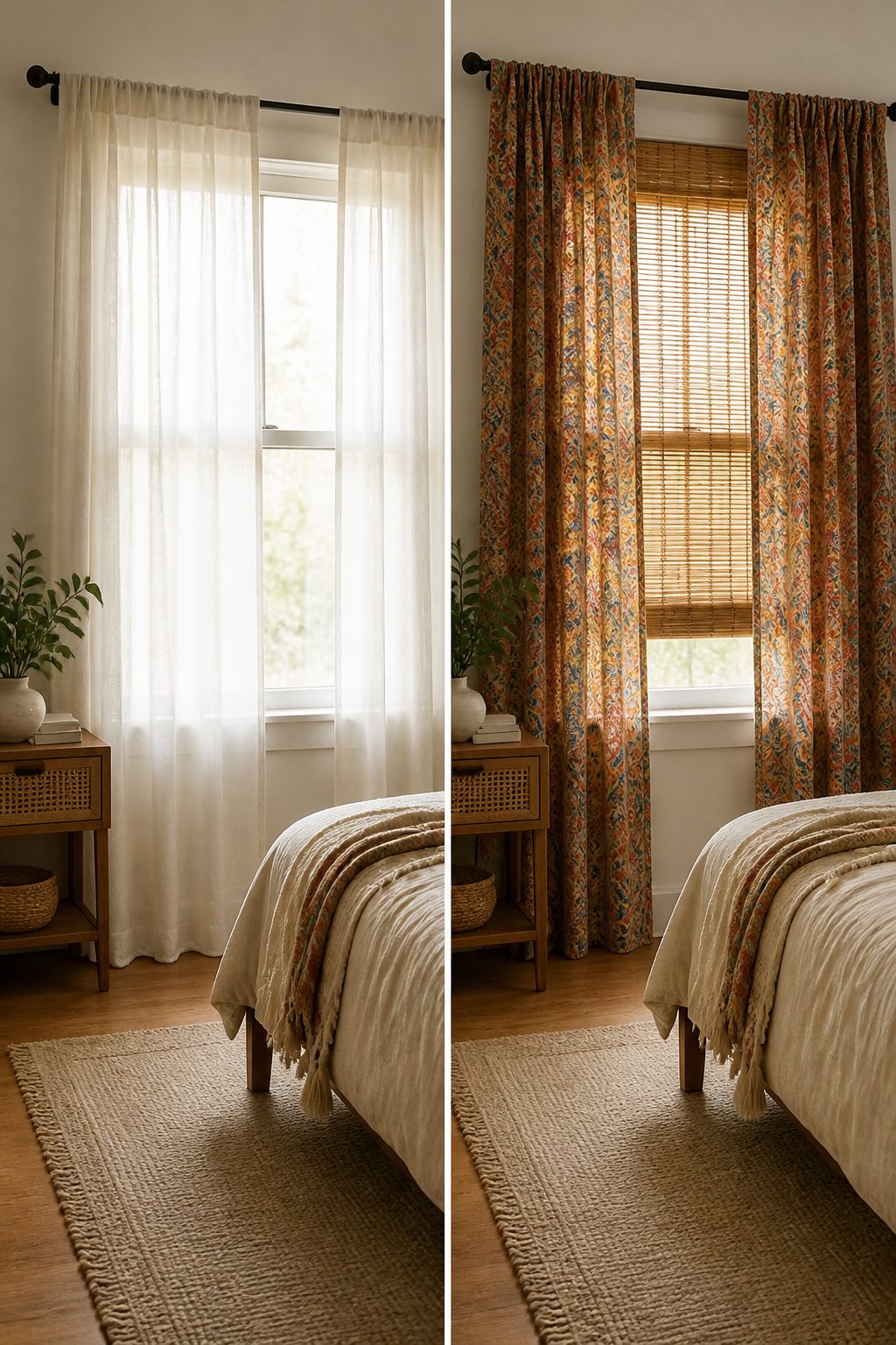
The fastest way to make a window look cluttered is to match everything. Two paisleys in the same scale, or two competing textures at equal weight, and the eye bounces around without landing anywhere.
What fixes it is varying the scale and letting one piece do the quiet work.
A bamboo shade under patterned cotton curtains is the starting point I keep coming back to. The shade gives you structure and a neutral, grounded base.
The cotton brings in color and pattern. Because the textures are different and the roles are split, they read as intentional rather than piled on.
The bridge piece matters more than people think. Without that solid, quieter layer, even well-chosen patterns start shouting at each other.
A neutral ground, whether it is the natural tone of bamboo or a solid earthy curtain, lets the busier element be the one moment of noise.
Where this usually goes wrong is coordination mistaken for matching. Two patterns in the same color family and similar size feel like a set that misfired.
The room ends up looking like you bought a kit and lost half of it. Better to let one layer carry the pattern and the other stay almost plain.
Fabric and Function
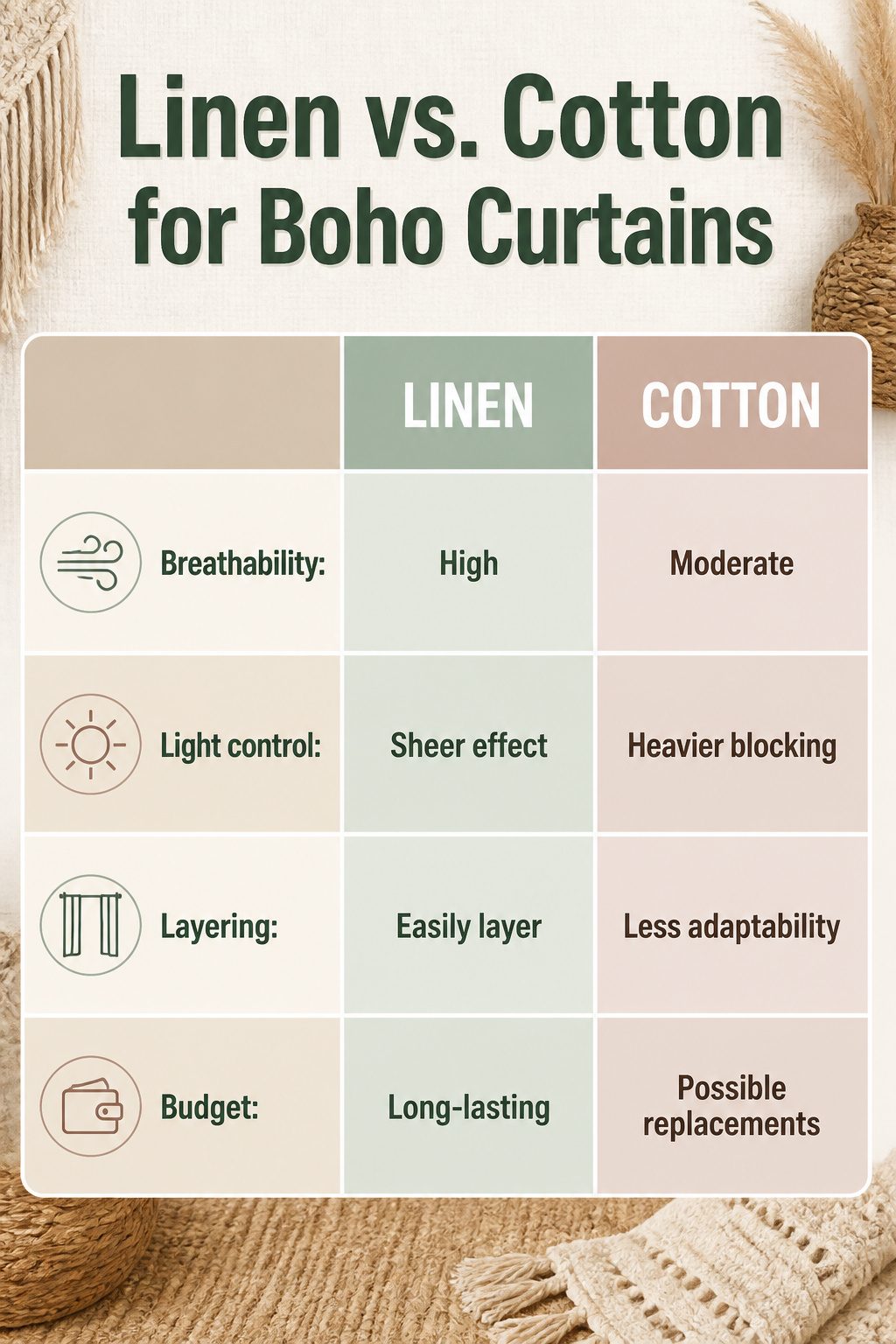
Linen and cotton carry the boho bedroom because they breathe, drape soft, and filter morning light into something gentle rather than harsh.
Over months they rumple and fade in a way that looks intentional, not worn out, which matters when your weekend project budget doesn’t stretch to replacements.
The catch is sleep. Sheer linen looks beautiful at 10 a.m. and lets in every streetlight at 2 a.m.
Layering sheers over blackout panels solves this without killing the look; the boho texture stays visible while the room actually gets dark. For renters who can’t swap hardware, this is the practical fix.
Cotton hangs heavier and blocks more on its own, but still won’t match true blackout. Choose based on whether you fall asleep to moonlight or need cave-dark to stay under.
Color Palette Rules
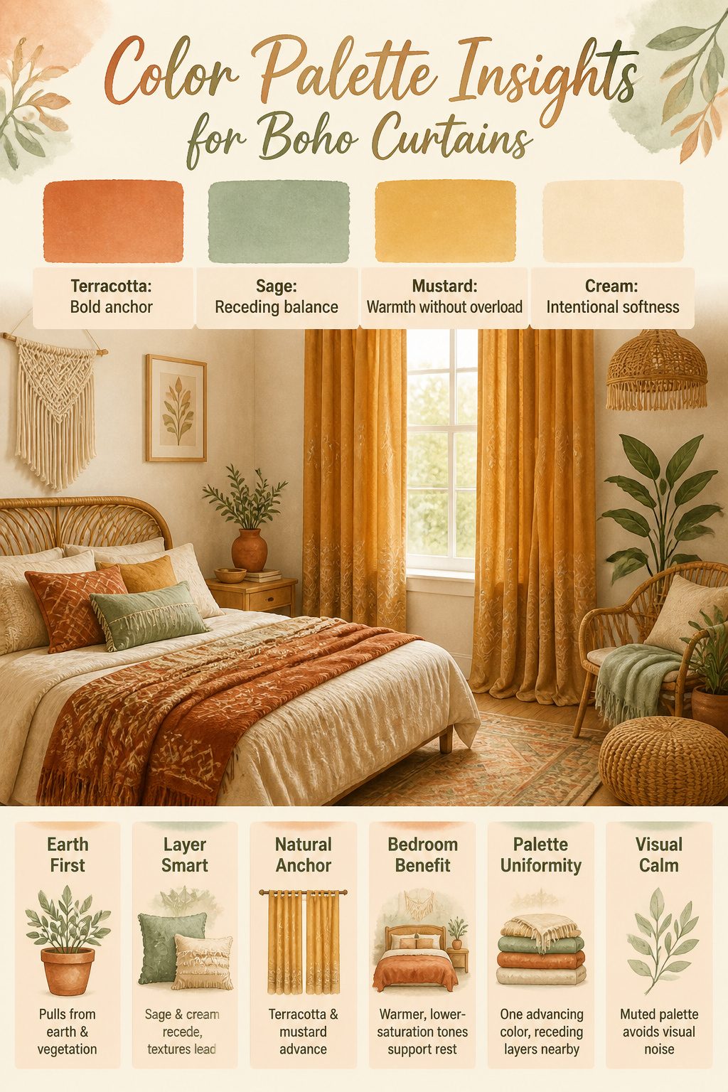
Terracotta, sage green, mustard, and cream do the heavy lifting in boho curtain choices because they pull from actual earth and vegetation rather than a color wheel.
Sage and cream recede, letting layered textures and busier patterns read as intentional rather than chaotic. Terracotta and mustard advance, which makes a bold curtain the natural color anchor for the whole room without any other big purchase.
The bedroom specifically benefits from warmer, lower-saturation tones because rest is the whole point. A mustard curtain reads as sunlight held at a distance; terracotta feels like late afternoon rather than alarm clock.
High-saturation colors in a sleep space tend to keep eyes busy even when they are closed, and the boho palette avoids that by staying muted.
Keeping the palette uniform matters more than hitting every earth tone at once. Too many competing warm shades mixed together, and the space clutters itself.
One advancing color on the window, paired with receding layers nearby, gives the collected look without the visual noise.
When Modern Boho Works
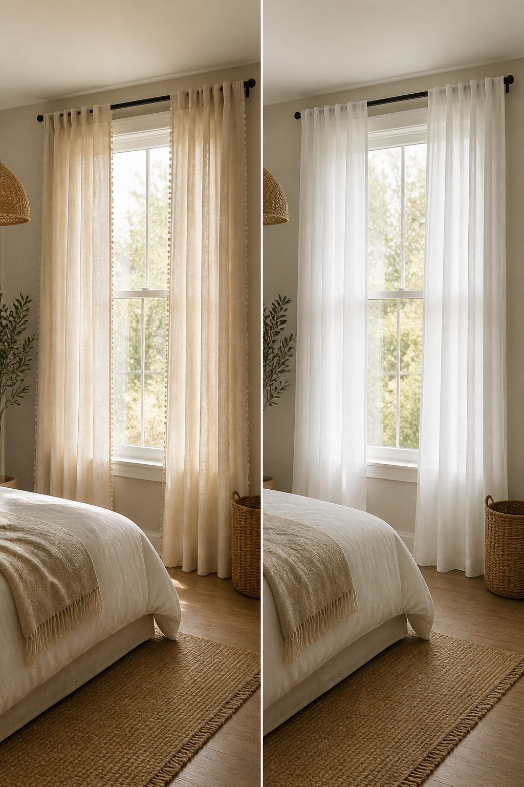
Modern boho curtains work when you stop adding and start editing. The look pairs clean lines with natural textures: a sleek rod, linen panels in a streamlined silhouette, maybe one subtle tassel trim.
That is the whole statement. Two patterns, tops, or the room starts looking like a festival tent.
Solid linen carries the boho feel through texture alone, no print required. I have seen bedrooms where the only "boho" element is the fabric itself, earthy-toned and unbleached, and the effect is calmer than any pattern stack.
The edit matters most at the window. Skip the layered valance, skip the second rod, skip the macrame if the linen is already doing the work.
Small apartments especially need this restraint. Lighter fabrics in a cohesive palette keep the room open, and one well-chosen texture beats three competing ones every time.
Frequently Asked Questions
Can boho curtains be modern?
Yes. Modern boho curtains pair clean lines and minimal hardware with natural fabrics like linen or cotton.
A sleek rod with earthy-toned panels and maybe one subtle tassel trim carries the style without clutter. Two patterns at most, or the room starts looking like a festival tent.
Do boho curtains have to be patterned?
No. Solid linen or cotton in earthy tones carries the boho feel through texture alone, no print required. The crucial part is layering: add macrame, tassel trims, or pair with bamboo shades to give depth without relying on prints.
One well-chosen texture beats three competing ones.
How do I measure windows for curtains?
Measure the width and height of the window you want to cover, including extra height if you plan to mount the rod above the frame. For fullness, curtain panels should measure at least two to three times the window width.
A 36-inch window needs 72 inches of panel or more.
How long should bedroom curtains be?
Boho curtains look best when they reach the floor, with a relaxed drape that pools slightly rather than breaking crisply at the sill. That slight pooling reads collected and intentional; a tailored break reads hotel room.
If you need them off the floor, tie-backs work better than shortening.