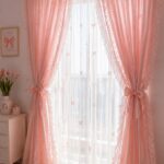

The only rule that matters for two different curtains in one room is matching the undertone, not the color itself. A greige that leans green will fight a greige that leans pink even if both look neutral under store lights.
Get the temperature right, and you can mix a bold pattern on the front windows with a solid in the same colorway on the bedroom set without the space feeling split down the middle.
1. Cohesive Color Palette
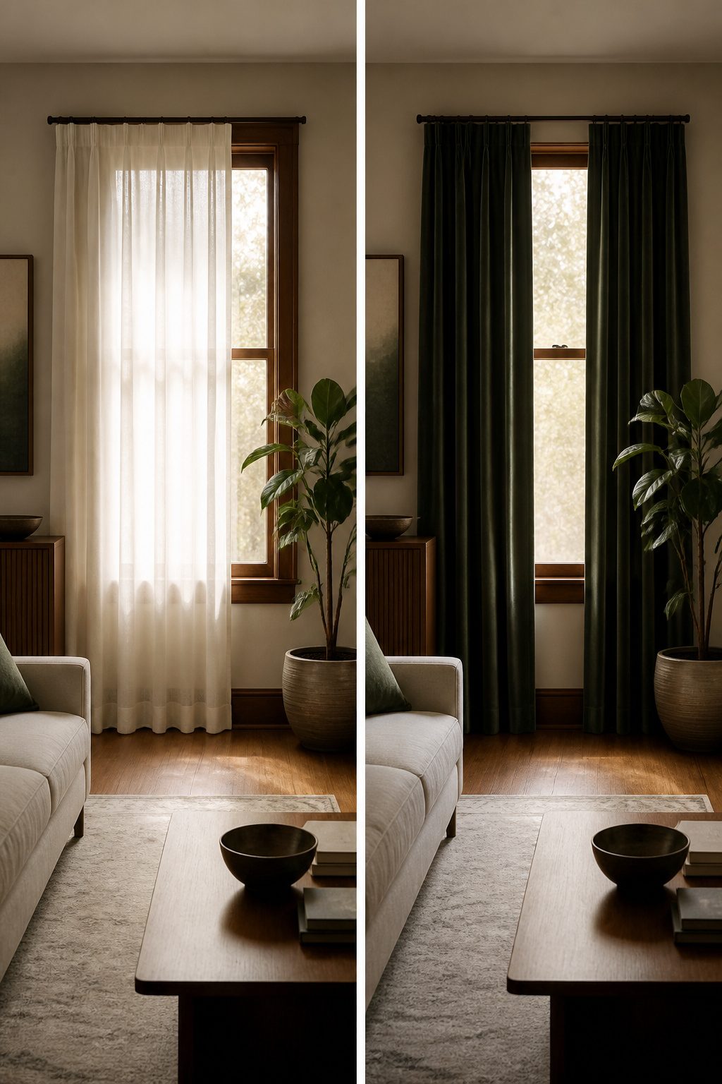
Color has a way of sneaking up on you when you hang two different curtains in one room.
The eye reads the whole wall at once, so the fabrics need to share a language even when they differ in weight or pattern.
The 60–30–10 rule gives that language a grammar: roughly sixty percent of the room in a dominant color, thirty in a secondary, and ten reserved for accents. Two curtain styles fit inside this frame without competing for attention.
Neutrals do the heavy lifting here. A warm white or soft gray on one window can bridge a bolder tone on another, keeping the room from feeling like a showroom split down the middle.
The undertones matter more than the colors themselves; a greige with a green cast will fight a greige that leans pink even if both read as "neutral" in the tube light of a store.
Match the undertone, and you can vary the saturation more freely.
The ten percent accent is where personality lives.
A trim, a tie-back, or a printed band in that small share of color keeps the pairing from reading too safe. Go past it, though, and the two curtains start shouting over each other.

ELEGANT DESIGN: 2 panels per package. Each blackout curtain measures 52" wide x 84" long. The design of silver grommet (1.6 inch inner diameter) creates casual elegance for your house, which makes the curtains easy to install and slide.

Heathered texture fabric adds dimension and style to any room

NATURAL CURTAINS STYLING: The INK+IVY Imani window panel features a back tab rod pocket and is crafted from 100% soft cotton. Its lightweight lining allows for a natural drape while gently filtering outside light, creating a warm, cozy ambiance
2. Layering Textures
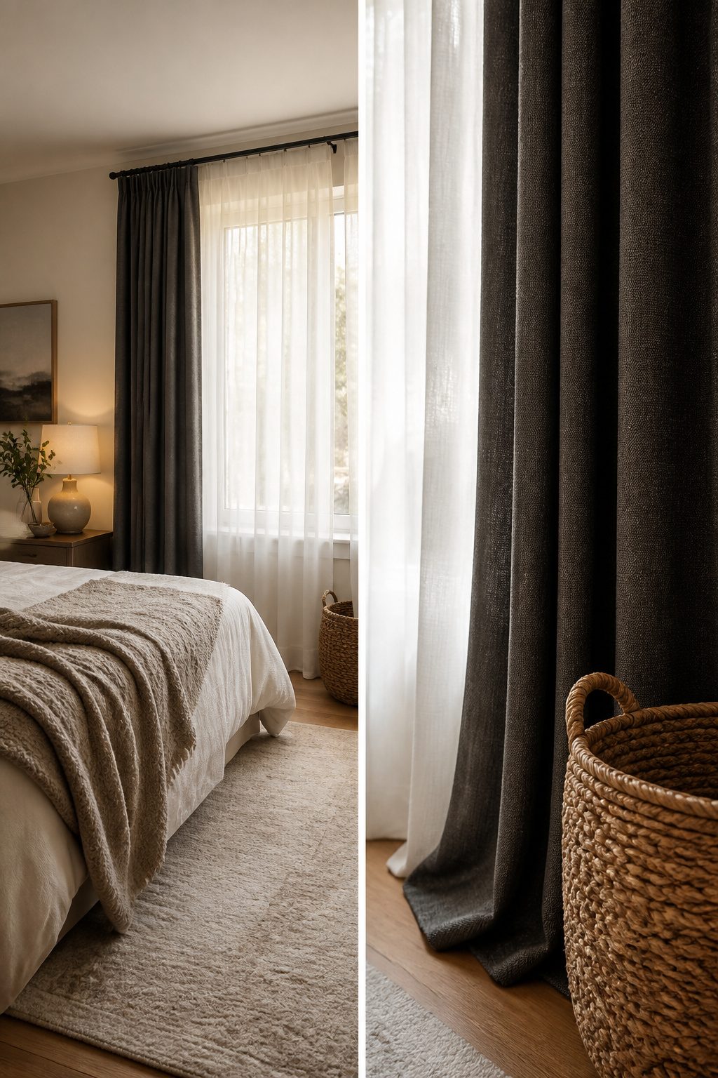
The most useful two-curtain setup I have seen in a rental pairs a sheer on the inner rod, closest to the glass, with a heavier drape on the outer rod facing the room.
That order matters: the sheer breaks the daylight without blocking it, and the outer layer gives you privacy or blackout when you need it.
A double rod keeps them independent, so you are not opening both layers every morning just to let light in.
Sheer inside, heavy drape outside also does more than look finished. The air gap between the two layers traps heat, which keeps a room cooler in summer and warmer in winter.
In my last apartment, the bedroom ran noticeably hotter than the living room until I added that second layer; the difference was the kind of thing you feel on your neck, not read on a bill.
For a real blackout in a bedroom, the front panels need to overlap in the center and sit close to the wall.
Light leaks at the edges otherwise, and the whole point of the heavier fabric is lost. A lighter sheer against darker drapes adds the most visual depth, though the contrast is optional if you prefer a quieter look.

DOUBLE DRAPERY ROD: Made of durable metallic iron, 1" diameter on front rod for the main thick panels; 5/8" diameter on back rod for sheer panels. The design of widening the distance between the two curtain rods allows the curtain to be pulled more smoothly without any fight. Double curtain rods constructions creates a layered look, add elegant to your windows and decorate home perfectly.

Product Details: Includes a pair of curtains, each measure 52"W x 90"L with 8 silver grommets top. The package comes with 2 blackout tiebacks and 2 crushed voile tiebacks for different styling.

Sold as 2 Panels: Each package includes 2 pieces jacquard sheer curtains. Each panel measures 40 inch width, 63 inch long(The curtain length not include top 1.5" header) 2 pieces 40 total width is 80 inches. The 2.5" rod pocket applicable to curtain rods no wider than 1". Multiple lengths and colors are available, please measure your window first for the right choose
3. Mixing Patterns and Solids
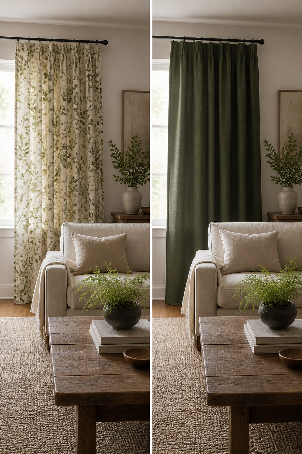
Patterned curtains carry the room when everything else is quiet. In my last rental, the walls were builder beige, the sofa was a hand-me-down gray, and the rug was a solid low-pile thing that hid cat hair.
A small-scale leaf print on the front windows gave the living room something to look at without asking for attention everywhere else.
The bedroom got the same fabric in the same colorway but solid, and the two spaces read as related rather than matched.
The reverse needs just as much discipline. If your rug already fights for notice or your chairs wear a geometric weave, solid drapes become the visual rest your eyes need.
I learned this the hard way with a striped dhurrie and floral panels that each wanted to be the story; the room felt like two people talking over each other until I swapped the panels for a heavy linen in a tone pulled from the rug’s ground color.
The common color is what saves you. A warm terracotta thread running through both fabrics, or a shared cool gray in the base cloth, lets the eye travel without forcing repetition.
One pattern per room, supported by solids or near-solids with texture, keeps the mix intentional rather than accidental.
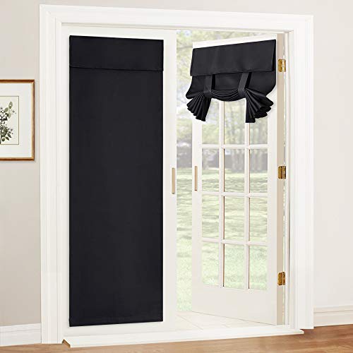
INSTALL IN 1 MINUTE (FULL KIT INCLUDED) – Everything you need is in the box: 1 curtain panel, 1 matching sticky strap, 1 extra backup strap, and 1 instruction manual. Say goodbye to drills and holes. We use Upgraded Stronger Adhesive straps for a secure hold. Perfect for French doors, renters, and homeowners who want to protect their permanent fixtures. (Note: Wait 24h after sticking for best results).

Premium & Easy-Care Fabric: These 84 inch blackout curtains are crafted from high-quality, 100% Polyester microfiber. These curtains are durable, naturally wrinkle-resistant, and machine washable (recommended in a mesh bag). Avoid bleach for vibrant, long-lasting color.

Soft Fabric and Size: Each curtain panel measures 52 inches wide by 72 inches long. The soft, substantial fabric falls into natural folds, giving bedroom and living room windows a neat, finished look
4. Room Function
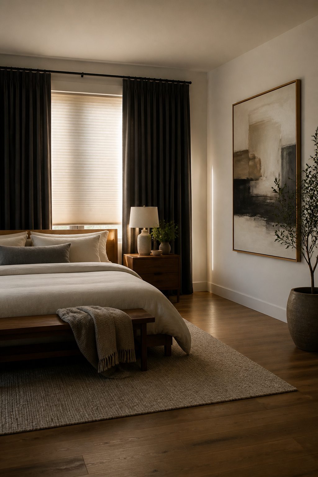
Bedrooms need blackout drapery layered over a cellular shade if you want the room to actually go dark.
The cellular shade traps air and blocks light at the frame; the curtain catches what slips past. I learned this the hard way after installing a single layer of medium-weight cotton and waking up at 5:47 every June morning.
Living rooms can handle something lighter.
A Roman shade paired with floor-length drapes gives you the formal structure without turning the space into a cave. The drapes frame the window; the shade does the daily work of filtering afternoon glare.
Kitchens and kids’ rooms run on opposite tracks. A roller blind with a lightweight valance keeps the kitchen clean and functional, nothing to catch grease or bump into while you work.
In a kids’ room, the same sheer-and-blackout pairing you’d want for yourself gets reversed in purpose: the sheer stays open for play, the blackout closes for naps.
Scott Checked Curtains in beige with Rebecca Texture Sheer Curtains is one combination that handles both modes without looking like a nursery threw up on itself.
The mistake is choosing the fabric first and the function second.
Velvet in a south-facing living room reads luxurious until you spend three years hauling the panels to the dry cleaner. Lighter layers there, heavier layers where sleep is the job.

VINTAGE FLORAL & PRINTED PATTERN: These Blue floral curtains feature a subtle botanical print that blends into the background as a soft visual detail. Perfect as vintage curtains, French Country curtains, or farmhouse printed curtains for living room, bedroom, or neutral spaces.
VINTAGE FLORAL & PRINTED PATTERN: These Blue floral curtains feature a subtle botanical print that blends into the background as a soft visual detail. Perfect as vintage curtains, French Country curtains, or farmhouse printed curtains for living room, bedroom, or neutral spaces.
VINTAGE FLORAL & PRINTED PATTERN: These Blue floral curtains feature a subtle botanical print that blends into the background as a soft visual detail. Perfect as vintage curtains, French Country curtains, or farmhouse printed curtains for living room, bedroom, or neutral spaces.
5. Avoiding Clashing Undertones
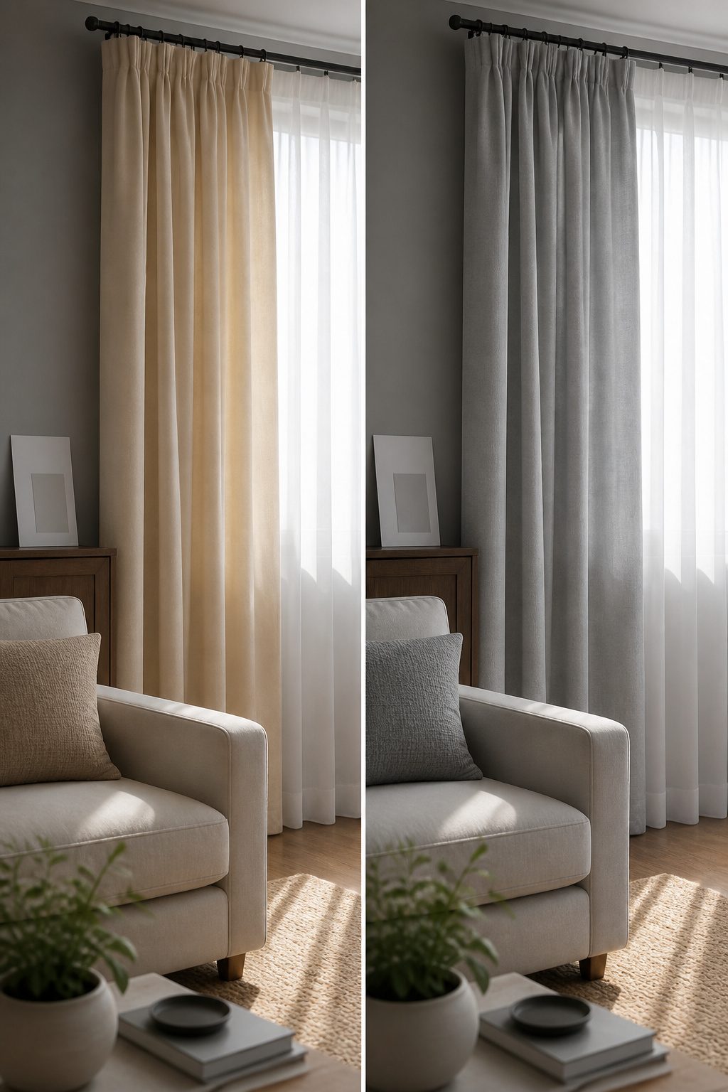
Beige, gray, and white fabrics hide undertones that only show up next to each other. I learned this the hard way with a pair of "white" sheers that turned blue-gray against cream walls.
Hold the swatch against something you know is warm or cool: a plain sheet of printer paper reads cool, unbleached muslin reads warm. If the fabric suddenly looks dirty or pink, you have found its undertone.
Warm beige carries yellow or peach; cool beige leans gray-green. Gray splits three ways, toward blue, green, or purple, and the wrong gray beside a warm cream looks like a stain.
Even stark white is not neutral: pure white, cool white with blue, and warm white with yellow all read as different colors in daylight.
Stores rarely label this on the bolt, so the paper test is the only check that travels with you.
Mixing undertones across two curtain sets in one room is the fastest way to make both look like mistakes.
Pick one temperature and run everything through it, walls included. The eye will read the room as intentional even if the colors themselves never repeat.

Package Includes: Set of 2 brich beige leaf pattern sheer linen curtains; each panel measures 52 inches wide by 84 inches long. Includes 8 bronze grommets with 1.6-inch inner diameter. Easy to install and slides smoothly.

SIZE - Sold as 2 curtains panels. Each panels 52 inches wide and 84 inches length, 104 inches wide in total.The rod pocket design of these window sheer curtains makes installation very simple and will not damage the curtain rod.

ADVANTAGES: Our window curtain fabric is smooth, delicate, soft, thick and compact with high drape. Light blocking sound insulation and thermal insulation. It has meticulous black silk interlayer to create 92% physical shading, which can well regulate the indoor light.
6. Curtain Hardware
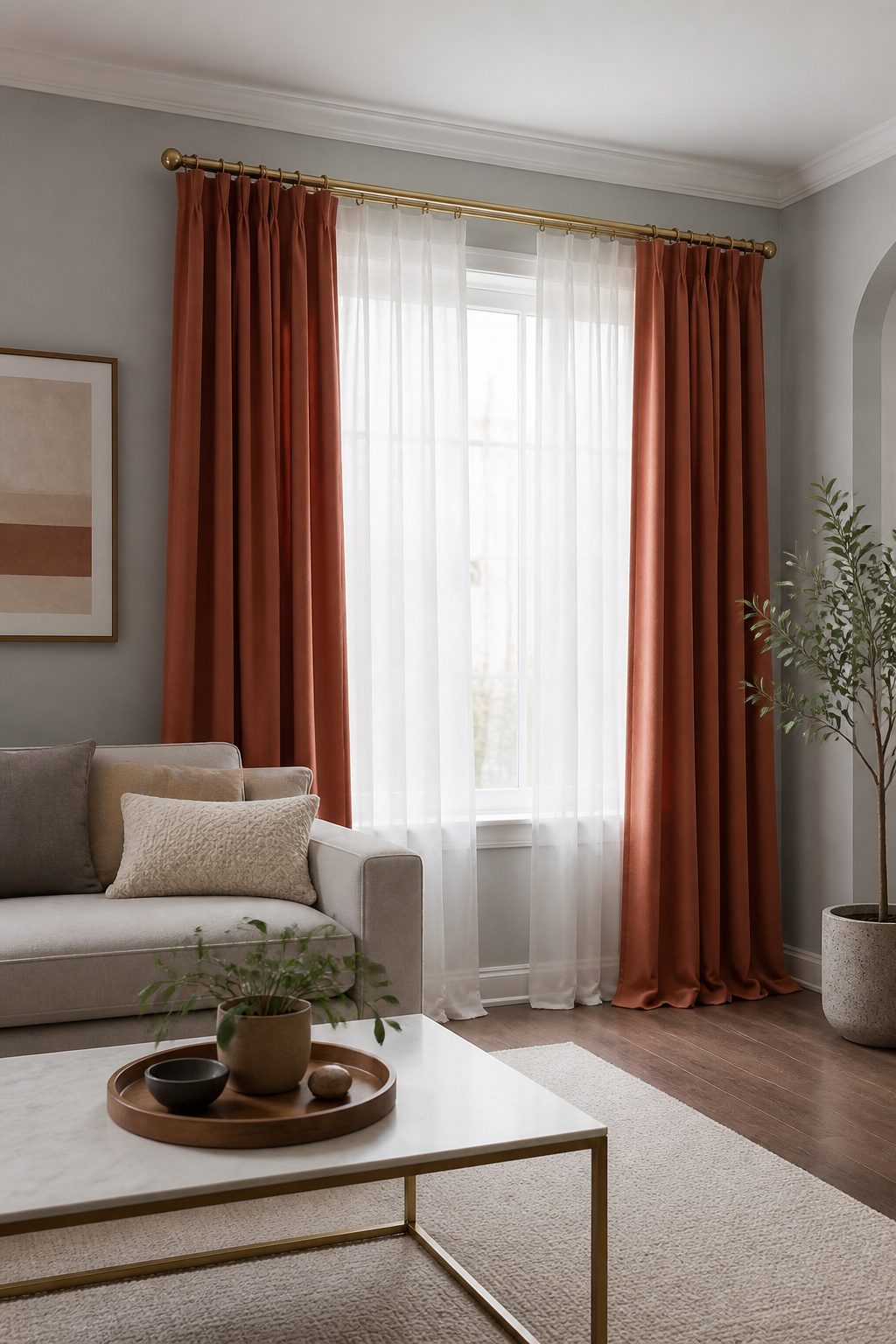
Curtain rods and finials sit closer to eye level than the fabric itself, so mismatched hardware will undermine two curtains that otherwise work together.
When I put a matte black rod on one window and brushed nickel on another in the same sightline, the difference registered before the fabrics even registered.
The finishes do not have to be identical down to the manufacturer, but they need to read as the same family: warm metallics with warm, cool with cool.
A double curtain rod or double track system lets each layer move independently, which matters more than it sounds.
The panel sewn to a sheer as one piece, sometimes marketed as a layered curtain, only opens and closes as a unit.
That limits light control and privacy control both; two separate layers on two rods is the more functional setup.
Rod placement follows a few basics. Mount the rod wider than the window frame so the stacked fabric clears the glass when the curtains are open.
Height usually sits a few inches above the frame, higher if you want the ceiling to feel taller. Measurements vary by window and wall, so take your own before ordering rather than copying a standard.
"As you enter a room, the curtains are the furthest point from you. They need to provide a stable backdrop, grounding the space to help you read the rest of the decor."
That stability depends on hardware reading as intentional, not accidental.

Distressed Design:Jacquard woven of colored yarn on greyish white fabric to create a color block two tone contrast,these drapes surely add depth and sophistication to your room.Especially well compliment your similar distressed area rugs and pillow covers.

LUXURIOUS VELVET FABRIC:Crafted from high-density velvet fabric, these curtains are silky-smooth, soft to the touch, and feature a rich, heavy drape for an elegant look,adding depth and luxury to living rooms, bedrooms, nursery and more.

Blackout technology blocks out most unwanted light while enhancing privacy
7. Fabric Practicality
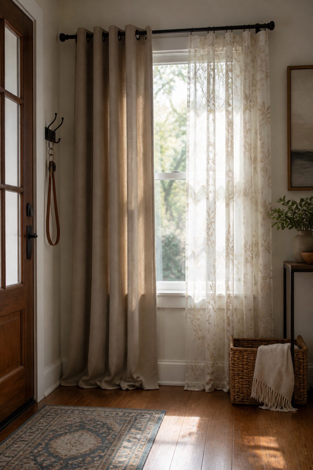
Washable synthetics belong near entryways and kids’ rooms, where two different curtains in one room means at least one panel will take the hit from muddy boots or sticky fingers.
I learned this the hard way with a linen-cotton blend that looked beautiful until the first rainy season, when the lighter-colored pair turned gray at the hem from repeated spot-cleaning.
A practical mix pairs a durable fabric where life happens with something more delicate where it does not.
The heavy, luxurious fabrics like velvet suit formal corners that guests see but children do not enter; light, airy fabrics like linen earn their keep in adult bedrooms where the main risk is afternoon sun.
Roman blinds work better than full curtains on smaller windows with radiators underneath, so that room already forces a fabric split.
Matching the color across that difference matters more than matching the material. Neutral curtains, white, beige, or grey, bridge the gap without demanding identical weaves.

Product Details: Includes a pair of curtains, each measure 52"W x 84"L with 8 silver grommets top. The package comes with 2 blackout tiebacks and 2 crushed voile tiebacks for different styling.

PRODUCT DETAILS: 1 curtain = of tulle attached 1 layer of decor omber white teal patterned curtain. The package comes with 2 tiebacks. Each gradient curtain is 52" wide. 1.6" diameter grommets make the curtains easy to install and slide

DOUBLE CURTAIN RODS: Made of durable metallic iron, 1" diameter on front rod for the main thick panels; 5/8" diameter on back rod for sheer panels. The design of widening the distance between the two curtain rods allows the curtain to be pulled more smoothly without any fight. Double curtain rods constructions creates a layered look, add elegant to your windows and decorate home perfectly.
Layering Techniques
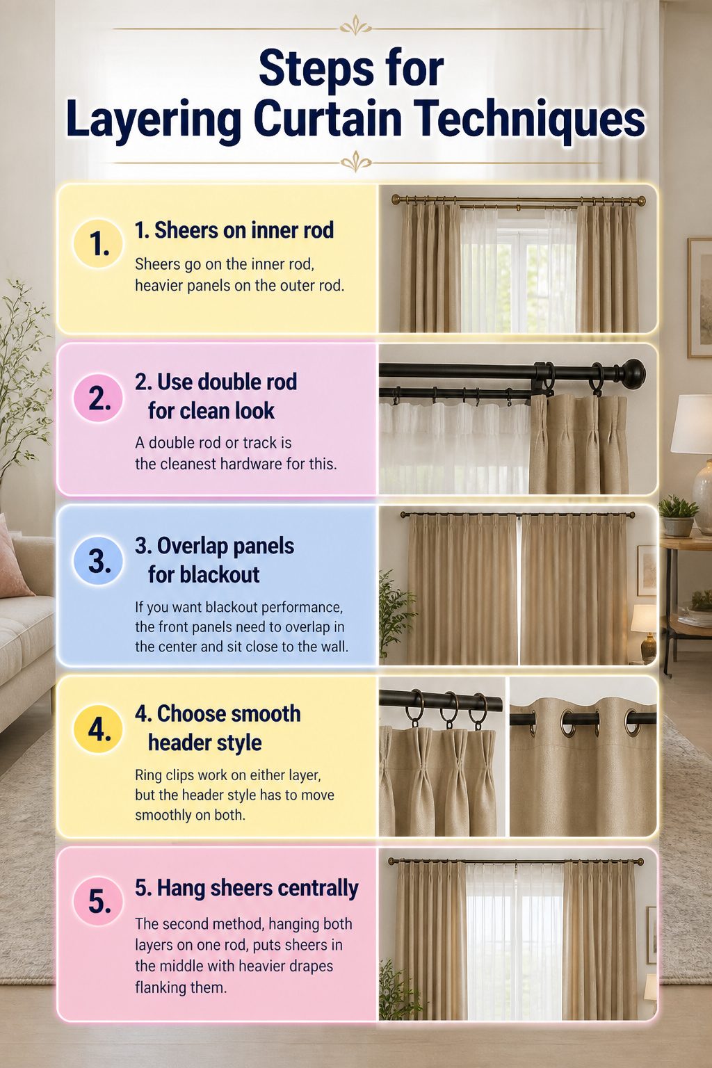
- Sheers go on the inner rod, heavier panels on the outer rod. This order matters because it lets you draw the opaque layer for privacy while the sheer still filters daylight, or close both when you want darkness.
- A double rod or track is the cleanest hardware for this. The inner carrier holds the sheer, the outer holds the front panel, and each layer slides independently so you’re not fighting both fabrics at once.
- If you want blackout performance, the front panels need to overlap in the center and sit close to the wall. Light leaks around the edges otherwise, no matter how heavy the fabric is.
- Ring clips work on either layer, but the header style has to move smoothly on both. Pinch pleat or grommet headers behave better doubled up than fussier styles that catch on each other.
- The second method, hanging both layers on one rod, puts sheers in the middle with heavier drapes flanking them. This suits seasonal swaps, since you can pull the outer panels and leave just sheers for summer.

Soft Fabric and Size: Each curtain panel measures 42 inches wide by 63 inches long. The soft, substantial fabric falls into natural folds, giving bedroom and living room windows a neat, finished look

Drapes with Effortless Elegance: Made of silky touch & satin like thick premium polyester.Lightweight curtains drape in more elegant and refined manner compared with Coating not eco fake linen blackout curtains.Coating fabric is harmful especially for pets and babies.

100% Blackout & UV Defense: Engineered with dual-layer construction (featuring a gray backing liner), these blackout curtains deliver 100% sunlight elimination and harmful UV blockage. Darker curtain hues enhance performance, keeping rooms cooler in summer and warmer in winter—ideal for nurseries, home theaters, and light-sensitive sleepers.
Color Coordination
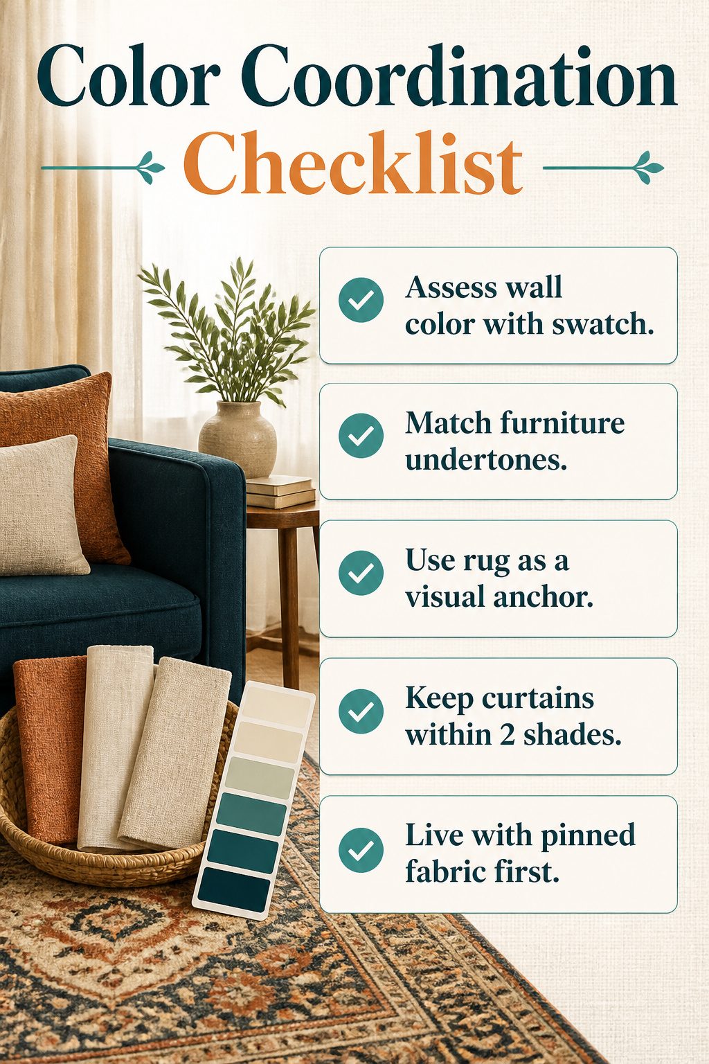
The wall color is your starting anchor, not an afterthought. Hold a curtain swatch against it in daylight and again after dark; paint shifts, and what reads as warm beige at noon can turn gray-green under lamps.
The largest furniture piece, usually the sofa or the bed, should share an undertone with at least one of your two curtains, even if the hue itself differs.
A navy velvet couch and a slate curtain share a cool undertone without matching, which keeps the eye moving instead of locking on a single block of color.
Your rug matters more than most people test for.
Spread the swatches directly on it, not beside it; the floor occupies more visual real estate than the windows, and a curtain that fights the rug will read as wrong from every seated angle.
Pull one curtain from a color already in the rug, and keep the second within two shades lighter or darker of your wall tone. That pairing repeats what exists rather than introducing a third voice.
If you are renting with white walls you cannot change, the rug and the sofa carry the entire palette.
A patterned drape that picks up the rug’s terracotta, paired with a solid sheer the color of your sofa’s oatmeal upholstery, builds the connection without demanding a paint can.
Test this by living with pinned-up fabric for two evenings before you hem or hang hardware; the mistake shows up by night three, and unpinned fabric is easier to swap than a drilled wall.
VINTAGE FLORAL & PRINTED PATTERN: These Blue floral curtains feature a subtle botanical print that blends into the background as a soft visual detail. Perfect as vintage curtains, French Country curtains, or farmhouse printed curtains for living room, bedroom, or neutral spaces.
VINTAGE FLORAL & PRINTED PATTERN: These Blue floral curtains feature a subtle botanical print that blends into the background as a soft visual detail. Perfect as vintage curtains, French Country curtains, or farmhouse printed curtains for living room, bedroom, or neutral spaces.
VINTAGE FLORAL & PRINTED PATTERN: These Blue floral curtains feature a subtle botanical print that blends into the background as a soft visual detail. Perfect as vintage curtains, French Country curtains, or farmhouse printed curtains for living room, bedroom, or neutral spaces.
Mixing Styles
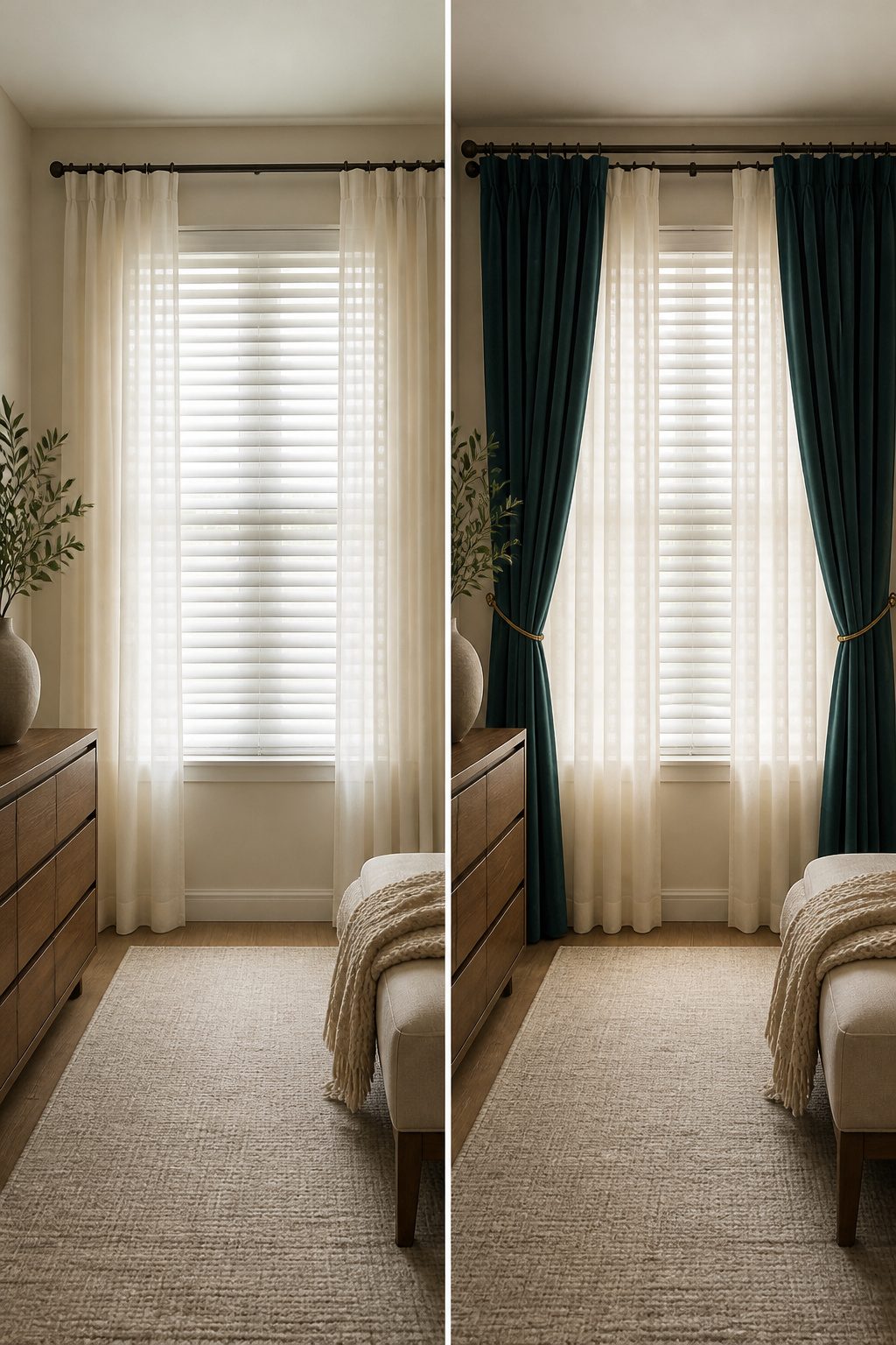
Layering drapes over blinds is the quickest way to get a custom look without the custom invoice. The blinds give you the clean lines and the light control; the drapes add the softness and the frame.
In my own searching, the pairing that kept coming up was sheers hung over blinds tilted open, which filters the light without killing it entirely, or heavier drapes drawn back to expose the blinds as a kind of architectural backdrop.
Two hardware paths keep it simple. A double rod puts sheers on the inner run and drapes on the outer, so you can close either layer independently.
The single-rod method parks sheers in the middle with heavier panels flanking them, which works better if you swap out seasonally, running just sheers through summer. Both setups use standard hardware you will find at any big-box store.
What sold me on this approach over full custom work is the insulation gap it fills.
Blinds alone leak light and bleed temperature; adding a fabric layer closes that down. Roman shades with dramatic drapes, or roller blinds behind sheers, hit the same balance of function and finish.
The mistake to avoid is treating the two pieces as afterthoughts: the color and weight need to talk to each other, or the window ends up looking like you solved two different problems at two different times.

Watercolor Floral Semi Sheer Curtains: Each package includes 2 panels measuring 55"W x 84"L (total width 104"). Light Filtering semi sheer curtains, Ideal for bedrooms, living rooms, dining rooms, guest rooms, or home offices.

SEMI-SHEER FRENCH DOOR PANELS: 52" w x 40" /panel, White leaf print on navy curtains. Featuring beautiful subtle texture background fabric, printed semi-sheer curtains also creates privacy in your home but still allows natural light in.
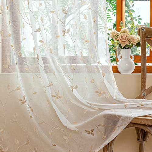
Standard Set: Sold in pairs, including 2 sheer panels, 3 inch inner Rod Pocket, makes it incredibly easy to hang with a curtain rod.
Small Space Color Combinations
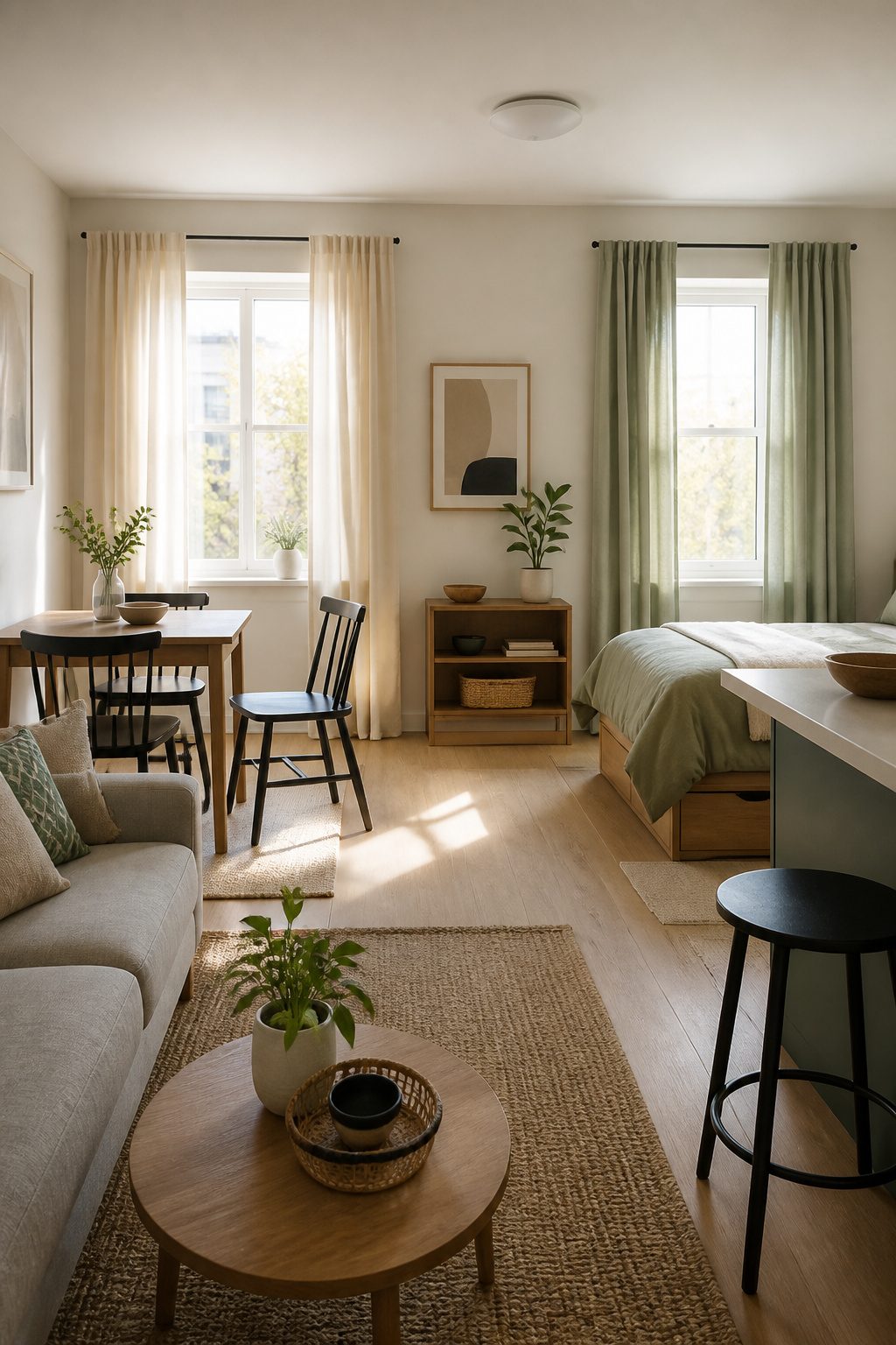
A soft cream on the windows facing your neighbor’s wall and a pale sage on the ones that get morning light will make a studio feel larger than matching every panel to the same beige.
The trick is keeping both fabrics in the same weight and weave so the shift reads as intentional, not like you ran out of material halfway through the project.
Keep the accent color to roughly one-fifth of the total curtain surface or the room starts to look chopped up, which is the opposite of what you want in tight quarters.
I learned this the hard way in a 380-square-foot rental where I tried rust orange on half the windows and the space felt like two rooms colliding.
Light neutrals paired with one soft accent color keep rooms feeling open because your eye travels without hitting a hard stop.
A warm white next to a quiet blue-gray, both in the same linen-cotton blend, gives you depth without the visual weight of a bold print or a dark solid.
The accent works best on the window you want to notice, usually the one with the view or the most daylight; the neutral carries the rest.
Frequently Asked Questions
Can you mix curtains with different colors in one room?
Yes, as long as the fabrics share a unified color scheme and matched undertones. Stick to the 60-30-10 rule: roughly sixty percent of the room in a dominant color, thirty in a secondary, and ten for accents.
Neutrals like warm white or soft gray on one window can bridge a bolder tone on another without making the space feel split down the middle.
How should I choose between patterned and solid drapes?
Use patterned drapes when the rest of your room is relatively plain, like builder beige walls or a solid sofa.
Choose solid drapes if your rug already fights for notice or your chairs wear a geometric weave, since solid fabric gives your eyes a place to rest.
Either way, pull a common color thread through both fabrics so the eye travels without forcing repetition.
What color combinations work best for small spaces?
Light neutrals paired with one soft accent color keep rooms feeling open because your eye travels without hitting a hard stop.
Try a warm white next to a quiet blue-gray in the same linen-cotton blend, or soft cream on one window and pale sage on another.
Keep the accent color to roughly one-fifth of the total curtain surface or the room starts to look chopped up.
Do double curtains look good?
Yes, double curtains add depth, texture, and visual interest while offering practical benefits like improved insulation and light control.
The most useful setup pairs a sheer on the inner rod with a heavier drape on the outer rod, which lets you draw the opaque layer for privacy while the sheer still filters daylight.
The air gap between layers also traps heat, keeping a room cooler in summer and warmer in winter.